Maryland Eastern Shore Hawks
A full-body hawk in maroon and grey with the initials “HBCU” on the left and the date “1886” on the right above the wordmark “UNIVERSITY OF MARYLAND EASTERN SHORE” in grey.
Hawks Alternate Logo
As a die-hard Hawks fan, you probably already know the rich history behind our team's logo. But have you ever taken a closer look at our alternate logo? The Maryland Eastern Shore Hawks alternate logo has a fascinating story behind it.
The alternate logo, which features a fierce hawk with its wings spread wide, was first introduced in 2004. It was designed to represent the strength and determination of our team and the fierce nature of the hawk itself. The logo also nods to the university's location on the Eastern Shore of Maryland, where hawks are a common sight in the skies.
The logo has gone through a few changes over the years, with minor tweaks to its design and color scheme. However, it has remained a beloved symbol among fans, often being used on merchandise and promotional materials. It has become a recognizable and iconic part of our team's identity and serves as a reminder of the hard work and dedication that our players bring to the court. So next time you see our alternate logo, remember the history and meaning behind it, and wear it with pride as a true Hawks fan.
Maryland Eastern Shore Hawks
2022 - Present
A full-body hawk in maroon and grey flying in an attack mode.
Maryland Eastern Shore Hawks
2007 - 2022
A flying and attacking hawk in maroon, grey and white.
Maryland Eastern Shore Hawks
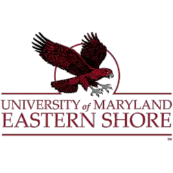
2007 - 2022
A flying and attacking hawk in maroon, grey and white above a double-lined wordmark "UNIVERSITY of MARYLAND EASTERN SHORE" in maroon with a maroon outline.
