SE Missouri State Redhawks
New in 2020, a side view of a red, black and grey redhawk’s head on top of the initials “SEMO” in white with red highlights on a black background.
Redhawks Alternate Logo
The Southeast Missouri State Redhawks are one of the most iconic NCAA Division I teams in the country. The school has been competing since its establishment in 1873 and is known for its strong academics, competitive athletics, and passionate fan base. But what many people don’t realize is that over the years, there have been several alternate logos used by SEMO to represent their athletic programs.
The first logo adopted by SEMO was a simple shield with an eagle perched atop it which was introduced back in 1972 when they became members of NCAA Division I Athletics. This logo featured prominently on all sports uniforms until 1991 when it was replaced with a more modernized version featuring two red hawks facing each other while perched atop a shield-shaped background with “SEMO” written across it vertically along both sides of the design.
This new look served as an official primary logo for nearly 20 years before being retired shortly after their move to Ohio Valley Conference play prior to the 2007-08 season where they adopted another unique design featuring just one hawk set against a white backdrop and outlined within black borders – this time without any text or shields included within its composition but still recognizable enough due maintain some continuity from previous incarnations.
While this particular variation only lasted four seasons before being discontinued upon joining OVC again during the 2011–12 campaign; the current iteration features a much cleaner aesthetic based around the same concept minus any additional details like lettering or shapes found in earlier versions – making them the perfect choice anyone looking represents team spirit without having added too many distracting elements into the mix (which could potentially detract from the overall message). Ultimately though no matter which version you choose show off your allegiance towards Redhawks, and always be sure to stay true colors!
SE Missouri State Redhawks
2020 - Present
A side view of a red, black and grey redhawk's head.

SE Missouri State Redhawks
2020 - Present
A side view of a red, black and grey redhawk's head on top of the initials "SEMO" in white with red highlights and a wordmark "REDHAWKS" in grey on a black background.

SE Missouri State Redhawks
2003 - 2020
A red, grey and black soaring Redhawk. Initials "SEMO" in red with white and black trim.
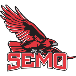
SE Missouri State Redhawks
2003 - 2020
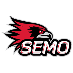
A red, grey and black side view of a hawk's head. Initials "SEMO" in red with white and black trim.
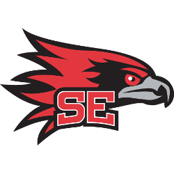
SE Missouri State Redhawks
2003 - 2020
A red, grey and black side view of a hawk's head above a red with white trim initials "SE."
SE Missouri State Redhawks
2003 - 2020
A red, grey and black side view of a hawk's head.
SE Missouri State Redhawks
2003 - 2020
A red, grey and black soaring Redhawk. Wordmark "SOUTHEAST MISSOURI" in white on a black background and "REDHAWKS" in red with white trim on a black background.

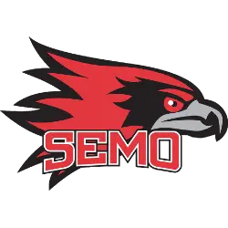
SE Missouri State Redhawks
2003 - 2020
A red, grey and black side view of a hawk's head. Wordmark "REDHAWKS" in red with white trim on a black background.

SE Missouri State Redhawks
2003 - 2020
A red, grey and black side view of a hawk's head. Red with white trim initials "SE" above a wordmark "MISSOURI STATE" in white all on a formed black background with an arched bottom.

SE Missouri State Redhawks
2003 - 2020
A red, grey and black soaring Redhawk. Wordmark "REDHAWKS" in red with white trim on a black background.

SE Missouri State Redhawks
2003 - 2020
A red, grey and black soaring Redhawk. Red with white trim initials "SE" above a wordmark "MISSOURI STATE" in white all on a formed black background with an arched bottom.

SE Missouri State Redhawks
2003 - 2020
A red, grey and black soaring Redhawk.


