UTSA Roadrunners
A side view of a roadrunner’s head in orange, blue, and white.
Former alternate logo.
Roadrunners Alternate Logo
The University of Texas at San Antonio (UTSA) Roadrunners have had a long and storied history since their inception in 1981. From the start, they have been known for their iconic bird logo which has become synonymous with UTSA athletics. However, what many people don’t know is that over the years there have been several alternate logos used by the team as well. In this blog post, we will take a look back at some of these logos and explore how they came to be part of UTSA’s visual identity.
One early logo was adopted in 1983 when then-athletic director Dr. Richard Duran decided to make an update from previous designs which featured only text or generic birds on them. He wanted something more unique and memorable so he commissioned artist Charles “Chuck” Ramirez to create one featuring an anthropomorphized roadrunner wearing sunglasses who could double as both mascot and symbol for the university's teams – thus creating what would eventually become known as “The Birdman". This design was widely embraced by fans across all sports until it was replaced with another version created by illustrator Mark Riddell in 1990 which featured a slightly different stylized bird but still retained much of its original spirit while also better integrating into other branding materials such as uniforms or print ads etc.
In 2006, yet another redesign took place under new athletic director Lynn Hickey who opted for a simpler approach based on traditional Native American art styles depicting two intertwined feathers representing strength through unity – something she felt best captured her vision for UTSA Athletics going forward into future generations. The current iteration first appeared during the 2010 season opener against Northeastern Oklahoma A&M College where it quickly became popular amongst students, alumni, and fans alike due to its bold colors & prominent placement within various marketing campaigns throughout campus life.
Overall, each successive version has served not only to capture attention but also represent values shared among members belonging to this proud community like courage & perseverance - making sure everyone knows exactly what being part of Roadrunner Nation means!
UTSA Roadrunners
2022 - Present
A blue, orange, and white side view of a roadrunner's head above the initials "UTSA" in streaking white with blue highlights and "ROADRUNNERS" in blue on an orange banner.
Former primary logo.
UTSA Roadrunners
2008 - 2022
A side view of a roadrunner's head in orange, blue, and white.
Moved to primary logo

UTSA Roadrunners
2008 - 2022
A blue, orange and white side view of a roadrunner on the run above initials "UTSA" in streaking white with blue highlights and "ROADRUNNERS" in blue on a orange banner.
UTSA Roadrunners
2008 - Present
A full-body roadrunner in orange, blue, and white.
UTSA Roadrunners
2008 - 2022
A blue, orange and white side view of a roadrunner's head peeking around initials "UTSA" in streaking white with blue highlights and "ROADRUNNERS" in blue on an orange banner.
UTSA Roadrunners
2008 - 2022
Initials "UTSA" in streaking white with blue highlights in front of a orange and blue state of Texas with a blue star on the location of San Antonio.
UTSA Roadrunners
2008 - 2022
A blue and orange backdrop of the Alamo with initials "UTSA" in streaking white with blue highlights and "ROADRUNNERS" in blue on an orange banner and "SAN ANTONIO."
UTSA Roadrunners
1988 - 2008
Mascot Rowdy the roadrunner's head in orange and blue.
UTSA Roadrunners
1988 - 2008
Mascot Rowdy the roadrunner's head in orange and yellow.
UTSA Roadrunners
1988 - 2008
A blue, orange, black and white side view of a roadrunner's head above initials "UTSA" in blue with black trim.
UTSA Roadrunners
1988 - 2008
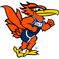
Mascot Rowdy Roadrunner is in a running position and wearing a uniform with the initials "UTSA" in orange, white, and blue.
