Kennesaw State Owls
A yellow with black trim interlocking letters “KS.”
Kennesaw State Owls
2012 - Present
A black, yellow and white owl with full wings spread above a wordmark "KENNESAW" in yellow and "STATE" in white with "OWLS" in black on a yellow banner.
Kennesaw State Owls
2012 - 2022
A black and yellow winged interlocked letters "KS."
Kennesaw State Owls
2012 - 2022
A black and yellow winged interlocked letters "KS."
Kennesaw State Owls
2012 - 2022
A black and yellow winged interlocked letters "KS."

Kennesaw State Owls
2012 - 2020
A front view of a black, yellow and white owl's head.
Kennesaw State Owls
2012 - 2016
A yellow with black trim owl's claw with a silver outline all on a white with black and silver trim circle.
Kennesaw State Owls
2012 - 2016
A yellow with black trim owl's claw with a silver outline all on a white with black and silver trim circle.

Kennesaw State Owls
2012 - 2016
A yellow with black trim owl's claw with a silver outline all on a black with silver trim circle.
Kennesaw State Owls
2012 - 2016
A yellow with black trim owl's claw with a silver outline.
Kennesaw State Owls
2000 - 2012
Connected initials "KSU." The letters "K" and "U" in yellow and the letter "S" in white with yellow trim.

Kennesaw State Owls
2000 - 2012
A black interlocking letters "KS."
Kennesaw State Owls
1990 - 2012
Owl eyes in black, white, and gold.
Kennesaw State Owls
1990 - 2012
The letter "O" with a brown and yellow owl's head next to the letters "wls" in brown with yellow trim and a arched wordmark "KENNESAW STATE" in black.
Kennesaw State Owls
1990 - 2012
Taken from the primary logo. An owl's head inside the letter "O" in black, yellow and white.
Kennesaw State Owls
1990 - 2012
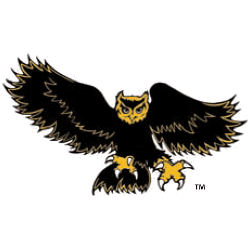
A black and yellow attacking owl with claws out in front.
Kennesaw State Owls Logo History
Across the Kennesaw State Owls logo history, alternate logos played a supporting role. These designs appeared on merchandise and special uniforms. Because of this, each Kennesaw State Owls Alternate logo gave fans more ways to connect with the program.
As branding evolved, the Kennesaw State Owls logo history introduced cleaner alternate styles. Designers refined colors and spacing for modern use. However, every Kennesaw State Owls logo PNG still reflected the sharp and confident Owls identity. Learn more on Wikipedia.
Today, this archive presents the complete Kennesaw State Owls logo history for alternate designs. All Kennesaw State Owls Alternate logos appear from start to today. Fans reviewing each Kennesaw State Owls logo PNG can also visit Kennesaw State Owls Wordmark Logo Page to explore official lettering styles.
"School Spirit Never Graduates"
From the first kickoff to the Final Four, your colors represent a lifetime of memories. Celebrate the traditions that define your campus and rep your alma mater with officially licensed gear for every season.
Shop the Official NCAA Collection


