Maryland Eastern Shore Hawks
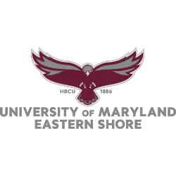
A full-body hawk in maroon and grey with the initials “HBCU” on the left and the date “1886” on the right above the wordmark “UNIVERSITY OF MARYLAND EASTERN SHORE” in grey.
Hawks Primary Logo
The Maryland Eastern Shore Hawks primary logo has a rich history that dates back to the early days of the university's athletic program. The logo, which features a fierce hawk with its wings spread wide, perfectly captures the spirit and determination of the university's sports teams. The hawk is a symbol of strength, agility, and grace, all qualities that the Hawks strive to embody on the court or field.
Over the years, the Maryland Eastern Shore Hawks primary logo has undergone several changes, but the essence of the design has remained the same. The first iteration of the logo, introduced in the 1960s, featured a simple silhouette of a hawk's head. In the 1980s, the logo was updated to include the full body of a hawk with its wings spread wide, ready to take flight. In the 2000s, the logo was modernized with sharper lines and a more dynamic pose, reflecting the university's commitment to staying current and competitive in the world of sports.
Today, the Maryland Eastern Shore Hawks primary logo is instantly recognizable and evokes a sense of pride and loyalty among fans. It represents not only the university's athletic prowess but also its values of determination, resilience, and teamwork. As a dedicated Hawks fan, I am proud to wear the logo on my merchandise and display it proudly at games. It is a symbol of our shared passion for our team and our unwavering support for their success. The Maryland Eastern Shore Hawks' primary logo will continue to be a source of inspiration and pride for generations of fans to come.
Maryland Eastern Shore Hawks
2007 - 2022
A side view of a hawk's head in maroon, black and grey.
Maryland Eastern Shore Hawks
1991 - 2007
A flying and attacking hawk in black and white inside a circle above the initials "UMES" in black.
College Sports Fan Products
