Maryland Eastern Shore Hawks
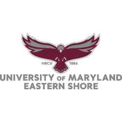
A full-body hawk in maroon and grey with the initials “HBCU” on the left and the date “1886” on the right above the wordmark “UNIVERSITY OF MARYLAND EASTERN SHORE” in grey.
Hawks Wordmark Logo
As a dedicated fan of the Maryland Eastern Shore Hawks, it's important to understand the history and significance behind our team's iconic wordmark logo. The logo, featuring a bold "Hawks" in black and gold, has been a symbol of our team's strength and determination since its creation in the 1970s. The wordmark was originally designed by a student at the university and has evolved over the years to become a recognizable emblem of our school's athletic program.
One of the most interesting aspects of our wordmark logo is its connection to the university's history. The "Hawks" font was inspired by the handwriting of the university's first president, Dr. William P. Hytche. This not only pays homage to the university's past but also serves as a reminder of the strong leadership and vision that has shaped our school and our athletic program. Additionally, the black and gold colors were chosen to represent the strength, power, and determination of our team, as well as the rich history and tradition of the university.
Over the years, the Maryland Eastern Shore Hawks wordmark logo has become synonymous with our team's success and identity. It has been featured on team uniforms, merchandise, and even the court at our home arena. As fans, we proudly wear the logo and display it at games and events, showing our unwavering support for our team. The wordmark is not just a logo, but a symbol of our school's pride and a representation of the hard work and dedication of our players and coaches. It is a visual representation of the spirit and passion that drives our team to victory.
Maryland Eastern Shore Hawks
2007 - 2022
A interconnected and locked initials "MES" with the letter "M" in maroon and the letters "ES" in grey with black trim.
Font: Custom


