Rider Broncs
A bronc’s head above the custom wordmark “RIDER” in cranberry with white trim and “BRONCS” in white on a cranberry background with white trim on a black-formed background.
Rider Broncs
2007 - Present
A horseshoe in cranberry outlined in white and black trim with grey holes.
Rider Broncs
2007 - Present
A bronc's head above the custom wordmark "RIDER" in red with white trim on a black formed background.

Rider Broncs
2007 - Present
A bronc's head in grey with black highlights next to a custom letter "R" in cranberry with white outline on a black formed background.
Rider Broncs
2007 - Present
A bronc's head in grey, with light grey highlights and a black trim.

Rider Broncs
2000 - 2007
A front lunging bronc in grey with black highlights with a horseshoe prevalent on its right hoof.
Rider Broncs
1994 - 2007
A standing bronc in white with black highlights wearing a black sweater with arched wordmark "RIDER" in white across the front.
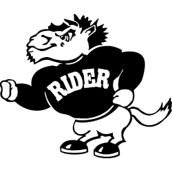
Rider Broncos Logo History
The Rider Broncs Alternate logo expanded branding options across sports. Over time, these designs appeared on uniforms, signage, and media graphics. As a result, the Rider University logo system stayed flexible without losing recognition. More background is available on Broncs Wikipedia for Rider Broncs.
As styles changed, the Rider Broncs logo history showed steady refinement. Therefore, alternate designs focused on cleaner shapes and improved balance. Each Rider Broncs Alternate logo remained easy to use while matching the official Rider University logo standards.
Although this page highlights alternates, wordmarks remain important. For that reason, visit the Rider Broncs Wordmark Logo Page to review official lettering styles. Together, wordmarks and the Rider Broncs Alternate logo complete the full Rider Broncs logo history from start to present.
"School Spirit Never Graduates"
From the first kickoff to the Final Four, your colors represent a lifetime of memories. Celebrate the traditions that define your campus and rep your alma mater with officially licensed gear for every season.
Shop the Official NCAA Collection


