
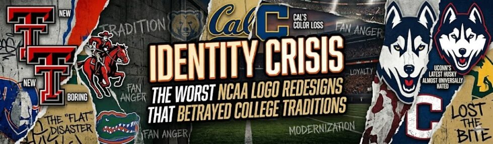
The Modernization Trap: Why NCAA Redesigns Often Backfire
The shift towards digital-first design has driven athletic departments to adopt clean vectors, simplified color palettes, and scalable marks optimized for phone screens. This ‘interface-first’ logic often treats a storied athletic program with the same clinical efficiency as a mobile app or a site dedicated to online casino reviews, prioritizing high-contrast clickability over century-old cultural heritage.
Branding expert Armin Vit once described the 2015 North Dakota “Fighting Hawks” logo as “a corporate-looking bird that could belong to a regional airline or a security firm.” This observation encapsulates the core issues with the current wave of collegiate rebranding, illustrating why so many college logo redesigns not only disappoint fans but also betray their expectations.
“When a logo loses its hand-drawn character, it doesn’t just change an image—it severs the emotional contract between a program and its community.”
The shift towards digital-first design has driven athletic departments to adopt clean vector graphics, simplified color palettes, and scalable marks optimized for mobile screens. However, college sports identity was never intended for such digital confines; it was rooted in decades of visual tradition—pennants, painted helmets, and hand-stitched patches imbued with character.
Athletic directors aim for a brand. Fans crave a mascot. This tension is palpable and rarely resolves neatly. While graphic efficiency enhances versatility, it often sacrifices soul. “Clean” too often morphs into “soulless” once it exits the design studio. This conflict is best understood as the Golden Thread interwoven in every failed redesign: the choice between honoring tradition and pursuing corporate efficiency. Some programs have severed this thread entirely, facing swift backlash. UConn’s 2013 Husky overhaul is an instructive example of the consequences of such a decision.
UConn’s 2013 Identity Crisis: A Lesson in NCAA Logo Changes That Failed
 Sports Logo History
 Before: A warm, rounded Husky with expressive character and genuine personality.
After: A sharp-edged, teeth-baring mascot stripped of nearly every distinguishing feature that made Jonathan Jonathan.
The fan community responded swiftly. Within days of the unveiling, over 10,000 people signed a petition demanding UConn revert to the original design, highlighting the university’s misjudgment of its audience’s attachment to the old logo. The core complaint extended beyond aesthetics; fans criticized the “corporate dog” quality of the redesign, feeling it was manufactured by committee rather than stemming from tradition. When viewing UConn’s logo evolution, it’s evident that mascot identity is built over generations, not focus groups.
The overarching lesson is clear: you can’t engineer toughness through a logo without sacrificing the personality that initially earned fan loyalty. This tension between aggressive modernization and authentic heritage isn’t unique to UConn, as the next case study reveals deeper damage when a redesign compromises basic visual function.
The Legibility Failure: Rutgers and the ‘Clunky’ Block R
Among the most technically puzzling of all controversial sports logo rebrands, Rutgers’ 2012 “Block R” update is noteworthy for a particularly ironic reason: a redesign intended to enhance visual clarity actually worsened it.
 Sports Logo History
 A logo that can’t survive the environment it was designed for hasn’t been modernized—it’s been undermined.
The heavy-handed stroke weights overwhelmed the letterform’s structure, stripping away the refined proportions that lent the original its authority. Rather than conveying collegiate prestige, the revised mark appeared bloated and generic, akin to a placeholder graphic rather than an identity representing a Big Ten program.
This pattern is worth examining—one that directly connects to broader tensions in how heritage and modern design collide. Speaking of heritage under threat, Rutgers isn’t the only program where specific visual traditions have been quietly dismantled. At Cal Berkeley, the battle wasn’t over letterforms—it was about a cherished color that fans had defended for over a century.
Messing with the ‘Old Gold’: Cal Berkeley’s Unpopular Palette
While UConn and Rutgers faced criticism for icon and letterform choices, Cal Berkeley’s 2013 rebrand demonstrated a crucial point: color and typography can betray tradition as thoroughly as any mascot redesign. This ranks among the most hated college football logo updates of the decade, with data to back it up.
 Sports Logo History
 For long-time supporters, that specific hue wasn’t merely an aesthetic preference; it embodied memory, ritual, and identity compressed into a color swatch. Changing it felt akin to quietly rewriting school history.
This epitomizes the failure of “unifying” rebrands that disregard century-old standards: standardization erases the specificity that renders college brands meaningful. Exploring how other programs have handled the evolution of their color identity sharpens the contrast with Cal’s misstep. This lesson persists, and as we’ll see, it’s one that newer programs continue to overlook.
Modern Fails: Texas Tech and the Minimalist Backlash
The pattern traced through UConn, Rutgers, and Cal isn’t a relic of early 2010s design thinking; it’s ongoing. Texas Tech’s modernization of the iconic Double T logo fell flat, drawing swift criticism from fans who deemed it “minimalistic” and “generic”—two descriptors no athletic brand desires.
The Change
Texas Tech’s updated Double T removed the visual weight and character that made the original mark instantly recognizable. The redesign embraced clean lines and flat geometry, aligning with a broader trend in sports branding that prioritizes scalability over soul. You can track how logos evolve across programs and eras, and the shift toward vector-flat aesthetics is unmistakable.
The Backlash
 Sports Logo History
 The Lesson
Depth and texture aren’t design nostalgia—they’re functional signals of tradition and pride. Flat vector icons simply can’t convey the emotional weight that a storied program demands. The Texas Tech situation suggests the minimalist trend isn’t just aesthetically frustrating; it’s strategically tone-deaf. This prompts a larger question: how do these missteps persist? The answer likely lies in the decision-making process.
Why Do Logos Get Worse? The ‘Committee’ Problem
Why do multi-million dollar rebrands consistently miss the mark? The issue rarely stems from design talent; it’s rooted in process.
Q: Why do logos get worse when more money is spent on them?
A: Because bigger budgets bring bigger committees. When athletic directors, university presidents, marketing officers, legal teams, and merchandise partners all have a seat at the table, every bold decision gets diluted. The result isn’t a logo—it’s a compromise.
According to the Sports Logo History archive, many failed redesigns stem from attempts to unify multiple athletic departments under a single brand system, stripping away the unique character each sport’s identity has accumulated over decades.
The 3 Killers of Good Design
- Design by committee — Too many stakeholders mean every sharp edge gets rounded off. Strong visual concepts die in approval rounds.
- The ‘safe’ choice mentality — Universities avoid bold decisions to dodge controversy, then face backlash for producing something forgettable.
- The agency disconnect — High-end design firms offer polish but often lack the cultural fluency that local fans have instinctively.
The safest logo is often the most damaging one—it pleases nobody and stands for nothing. Fan bases don’t just seek accuracy; they desire soul.
What this ultimately points to is a deeper question about the true purpose of these identities—a question we must explore next.
Preserving the Visual Soul: A Call for Historical Respect
The cases examined throughout this article share a single lesson: tradition is the brand. Strip away decades of accumulated meaning—the colors worn through championship seasons, the mascot shapes ingrained in fan memory—and you don’t get a modern identity. You get a blank page.
As Sports Logo History illustrates through its documentation of conference and program identities, the most enduring visual systems are those that evolved with their history, not against it. “The secret longevity of a logo lies in its ability to tell a story that fans already know by heart.” This isn’t sentimentality; it’s strategy.
The best logos aren’t created in boardrooms. They’re forged from decades of context, conflict, and community. Looking backward isn’t nostalgia; it’s the most intelligent research a design team can conduct.
Key Takeaways:
- Rebrands that disregard heritage consistently generate backlash.
- The “committee problem” prioritizes internal consensus over fan connection.
- Historical archives are an underutilized creative asset.
Explore the full NCAA historical archive at SportsLogoHistory.com before your program’s next redesign conversation begins.
Last updated: May 20, 2026