Penn Quakers
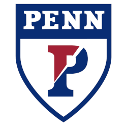
A half-blue and red letter “P” with a white slash through the letter on a shield with a wordmark “PENN” in white. Removed the red trim on the wordmark.
Penn Quakers
2017 - Present
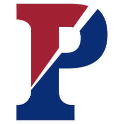
A split half blue and red letter "P" with a white slash through the letter and a white outline.
A slight change to the letter "P."

Penn Quakers
2004 - 2017
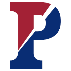
A split half-blue and red letter "P" with a white slash through the letter and a white outline.

Penn Quakers
1981 - 2004
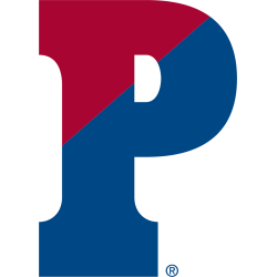
A split letter "P" in red and blue.

Penn Quakers Logo History
The Penn Quakers Alternate logo supported the brand throughout the Penn Quakers logo history. Over time, alternates introduced secondary symbols and subtle layout changes. As a result, the Penn Quakers logo PNG collection offered variety without losing recognition. More background appears on Quakers Wikipedia.
As design trends evolved, each Penn Quakers Alternate logo reflected its period. Therefore, some designs stayed traditional, while others used cleaner details. These updates expanded the Penn Quakers logo history while keeping a strong link to familiar Penn Quakers logo PNG designs.
While this page focuses on alternates, typography remains important. For that reason, visit Penn Quakers Wordmark Logo Page to see how lettering aligns with alternate designs. Together, wordmarks and each Penn Quakers Alternate logo complete the visual record of the Penn Quakers logo history from start to present.
"School Spirit Never Graduates"
From the first kickoff to the Final Four, your colors represent a lifetime of memories. Celebrate the traditions that define your campus and rep your alma mater with officially licensed gear for every season.
Shop the Official NCAA Collection
Quakers Products
Auto Amazon Links: Could not resolve the given unit type, . Please be sure to update the auto-insert definition if you have deleted the unit.


