Rider Broncs
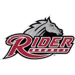
A bronc’s head above the custom wordmark “RIDER” in cranberry with white trim and “BRONCS” in white on a cranberry background with white trim on a black-formed background.
Rider Broncs
1994 - 2007
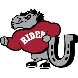
A standing bronc in grey with black highlights wearing a red sweater with arched wordmark "RIDER" across the front and is leaning on a large horseshoe in grey and black.
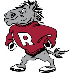
Rider Broncs
1989 - 1994
A strutting bronc in grey and white with black highlights wearing a red sweater with a letter "R" in white.
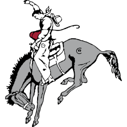
Rider Broncs
1928 - 1989
A cowboy in white and black riding a bucking horse in grey with black highlights. The initials "RC," for Rider College, can be seen above the rear legs.
Illustrated by Mens` Basketball Head Coach Clair Bee in 1928.
Rider Broncs Logo History
The Rider Broncs Primary logo forms the backbone of the team’s visual identity. Across the Rider Broncs logo history, designers adjusted shape, balance, and detail. As a result, the Rider University logo remained clear on uniforms, courts, and digital platforms. More context is available on Broncs Wikipedia.
Rather than frequent redesigns, the Rider Broncs Primary logo changed through careful updates. Therefore, improvements focused on legibility and modern use. These refinements strengthened the Rider Broncs logo history while preserving familiarity tied to the official Rider University logo.
While this page highlights primary branding, alternate designs also support the identity. For that reason, visit the Rider Broncs Alternate Logo Page to review secondary marks. Together, alternates and the Rider Broncs Primary logo complete the visual record of the Rider Broncs logo history from start to present.
College Sports Fan Products

Vote Now / All Broncs Fans!!
As a proud Rider Broncs fan, I urge you to recognize the strength and energy behind this logo. The Broncs emblem features a powerful bronco that represents toughness, determination, and athletic pride. Among MAAC logos, it stands out for its bold and spirited identity.
Moreover, the name “Broncs” reflects grit, independence, and competitive drive. It captures momentum and the pursuit of victory. While other logos feel less inspiring, this one commands respect. For that reason, the Rider Broncs logo deserves your support in this logo battle.


