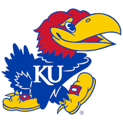
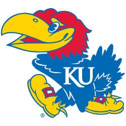
Kansas Jayhawks
Right-facing Jayhawk in blue, red, and yellow wearing shoes and “KU” on the chest. Change to the shade of blue and a new font Trajan typeface.
Jayhawks Alternate Logo
The Kansas Jayhawks alternate logo has been a part of the school's identity for over 30 years. The original design was created in 1989 and featured an interlocking "KU" with the mascot, Big Jayhawk, perched atop it. Since then, the logo has gone through several changes to keep up with current trends and styles while still remaining true to its roots.
The first major change came in 2005 when a new version of Big Jayhawk was introduced that had more detail and color than its predecessor. This updated look also included an outline around both letters making them stand out even more from each other. In 2014, another redesign took place which saw the bird take on a slightly different shape as well as having additional feather details added along his wings and tail feathers giving him greater depth and dimensionality compared to earlier versions of this iconic symbol.
Today’s version is much closer to what we see today; however, there are subtle differences such as brighter colors used for certain parts like his eyes or beak that make it unique from previous iterations over time. As one can see, the Kansas Jayhawks Alternate Logo History is full of interesting changes throughout various decades but ultimately remains true to its original concept - representing strength, resilience, and pride all wrapped into one powerful image!
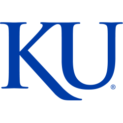
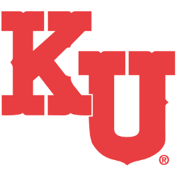
Kansas Jayhawks
2006 - Present
Initials "KU" in blue and font Trajan typeface.
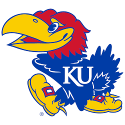
Kansas Jayhawks
2006 - Present
Left-facing Jayhawk in blue, red, and yellow wearing shoes and "KU" on the chest.
Change to the shade of blue and a new font Trajan typeface.
Kansas Jayhawks
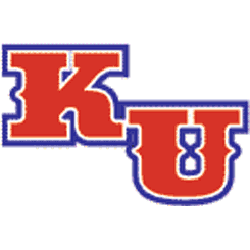
2001 - 2005
The letters "KU" in blue with red trim in a custom font.
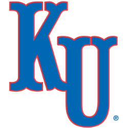
Kansas Jayhawks
2001 - 2005
The letters "KU" in red with blue trim in a custom font.

Kansas Jayhawks
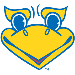
2000 - Present
Female looking partial jayhawk in yellow and blue.
Kansas Jayhawks
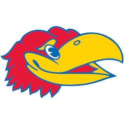
1992 - Present
A Jayhawk's head in blue, red, and yellow facing to the right.
Kansas Jayhawks
1989 - 2001
The letters "KU" in red with white and blue trim in a custom font.
Kansas Jayhawks
1946 - 2006
A Jayhawk in blue with yellow shoes and white "KU" on its chest walks to the left.
Kansas Jayhawks
1941 - 1988
The letters "KU" in red in a custom font.
College Sports Fan Products