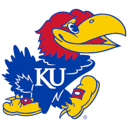
Kansas Jayhawks
Right-facing Jayhawk in blue, red, and yellow wearing shoes and “KU” on the chest. Change to the shade of blue and a new font Trajan typeface.

Kansas Jayhawks
2006 - Present
Arched wordmark "KANSAS" in blue with white trim.
Font: Trajan
https://font.download/font/trajan-pro

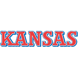
Kansas Jayhawks
2006 - Present
Wordmark "KANSAS" in blue.
Font: Trajan
https://font.download/font/trajan-pro
Kansas Jayhawks
1989 - 2001
Wordmark "KANSAS" in red with blue trim.
Font: Trajan
https://font.download/font/trajan-pro

Kansas Jayhawks
1941 - 1988
Wordmark "KANSAS" in blue.
Font: Trajan
https://font.download/font/trajan-pro

Kansas Jayhawks
1941 - 1988
Wordmark "KANSAS" in red.
Font: Trajan
https://font.download/font/trajan-pro
Kansas Jayhawks Logo History
The Kansas Jayhawks Wordmark logo has changed several times, each update adding a new level of detail and personality. Early wordmarks used simple lettering, while later designs introduced sharper outlines and bolder shapes. These changes strengthened the identity of the program over time. For more historical background, visit the Kansas Jayhawks Wikipedia page.
As seen throughout the Kansas Jayhawks logo history, the wordmark has played a major role in shaping the team’s presence in college sports. This page presents each version in order, helping fans clearly see how the lettering evolved. To compare these designs with the main emblem, you can visit Kansas Jayhawks Primary Logo Page, which adds helpful context to the wordmark collection.
Each Kansas Jayhawks logo PNG provided here features sharp lines and clean detail, making it easy to study how the Kansas Jayhawks Wordmark logo changed across different eras. The complete set displayed on this page offers a clear view of the team’s visual progression from past to present.
College Sports Fan Products