Stetson Hatters
A green letter “S” with the silhouette of a cowboy hat in the center of the letter.
Stetson Hatters
2018 - Present
A green letter "S." The silhouette of a cowboy hat in the center of the letter has been removed.

Stetson Hatters
2008 - 2017
3-D Initials "SU" in white with green and black trim.
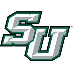
Stetson Hatters
2008 - 2017
A brown with black trim and a green ribbon cowboy's hat.

Stetson Hatters Logo History
The full set of Stetson hatters alternate logo designs highlights how the program evolved its branding with updated shapes, colors, and lettering. Many alternates were inspired by previous primary marks while bringing new energy to uniforms and merchandise. The Stetson Hatters Logo history details these changes across decades. More information about the team can be found on their Wikipedia page.
Several designs were later reproduced as Stetson hatters logo PNG files for digital and print use. These logos supported the wider Stetson university football logo system while enhancing brand consistency. The Stetson Hatters Logo history also includes modern alternates that match current design standards. Fans can view all text-based marks on the Stetson Hatters Wordmark logo page for additional reference.
Each Stetson hatters alternate logo represents an important chapter in the program’s visual identity. Some designs focused on athletic motion, while others emphasized traditional elements of the Stetson Hatters Logo. The Stetson Hatters Logo history shows how these alternates contributed to the ongoing evolution of the team’s branding. This page displays all alternates from start to present, alongside downloadable Stetson hatters logo PNG files.


