Chattanooga Mocs
A block letter “C” in gold with white and blue trim. Called the power “C” logo. The gap was removed from the previous logo.
Chattanooga Mocs
2014 - Present
A mockingbird foot print in gold with white and navy trim.

Chattanooga Mocs
2008 - Present
A side view of a mockingbird in navy, white, and silver with a gold outline.

Chattanooga Mocs
2008 - 2014
A mockingbird flying to the right in navy, silver and white with a gold outline.

Chattanooga Mocs
2008 - 2014
An arched wordmark "MOCS" in white on a navy background over the front of train in silver, white and navy all with a silver outline.

Chattanooga Mocs
2008 - 2014
A block letter "C" in navy with white and gold trim.

Chattanooga Mocs
2008 - 2014
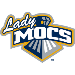
A scripted wordmark "Lady" in white with navy trim next to an arched wordmark "MOCS" in white on a navy background over the front of train in silver, white and navy all with a silver outline.
Chattanooga Mocs
2007 - Present
A block letter "C" in gold with white and blue trim above a wordmark "CHATTANOOGA" in navy and "MOCS" in gold.
Chattanooga Mocs
1997 - 2008
The mascot "Scrappy" in silver, white, gold and navy wearing a conductor's hat and driving a train in navy, silver and white.
Chattanooga Mocs
1997 - 2008
The mascot "Scrappy" in silver, gold and white with navy highlights wearing a railroad hat leaning on the wordmark "MOCS" in white on a navy background with gold and silver trim.
Chattanooga Mocs
1997 - 2008
The mascot "Scrappy" in silver, gold and white with navy highlights wearing a railroad hat with his right wing fanning out.
Chattanooga Mocs
1997 - 2008
The mascot "Scrappy" in silver, white, gold and navy wearing a railroad hat driving a train in navy and white on a gold background above the wordmark "THE UNIVERSITY OF TENNESSEE AT" in gold and "CHATTANOOGA" in white with a gold outline.
Chattanooga Mocs
1997 - 2008
The mascot "Scrappy" in silver, gold and white with navy highlights wearing a railroad hat.

Chattanooga Mocs
1997 - 2008
The mascot "Scrappy" in silver, gold and white with navy highlights wearing a railroad hat on top of the letter "C" in gold with navy trim.

Chattanooga Mocs
1997 - 2008
The mascot "Scrappy" in silver, gold and white with navy highlights wearing a railroad hat leaning on the initials "UTC" in white with navy trim on a gold background with a silver trim.

Chattanooga Mocs
1997 - 2008
The mascot "Scrappy" in silver, gold and white with navy highlights wearing a railroad cloths and hat, boots and with arms crossed.
Chattanooga Mocs
1997 - 2008
The mascot "Scrappy" in silver, gold and white with navy highlights wearing a railroad hat leaning on the wordmark "CHATTANOOGA" in white on a navy background with gold and silver trim.

Chattanooga Mocs
1997 - 2008
A wordmark "MOCS" in white on navy formed background on the front of train and part of train is coming through the letter "O" on a gold formed background and a silver outline.
Called the "Cowcatcher logo" referring to the front lower grill of the train that helped push objects from the train tracks.
Chattanooga Mocs
1984 - 1996
A wordmark "mocs" in blue with two white feathers hanging from the left side of the letter "O."
Chattanooga Mocs Logo Alternatives
The earliest Chattanooga Mocs alternate logo designs were simple and text-focused, designed to clearly represent the team on uniforms and printed materials. Over time, the Chattanooga Mocs logo history expanded to include mascots, stylized lettering, and dynamic elements that brought energy and personality to each variation. The UT Chattanooga Mocs logo also began appearing in PNG format for digital platforms, ensuring consistent branding across all media.
In the late 20th century, the Chattanooga Mocs alternate logo evolved to incorporate modern design trends while keeping ties to the team’s history. Designers enhanced the imagery of the moccasin mascot and refined the typography to create versatile logos suitable for merchandise, social media, and promotional materials. Each iteration in the Chattanooga Mocs logo history represents a step in the program’s identity development.
Today, the Chattanooga Mocs alternate logo stands as a complement to the primary logo, reflecting both tradition and modern branding standards. Fans, athletes, and alumni recognize the UT Chattanooga Mocs logo across apparel, digital platforms, and athletic events. For more details on the team’s history, visit the Chattanooga Mocs history page. For related designs, see the Chattanooga Mocs wordmark logo page.


