Chattanooga Mocs
A block letter “C” in gold with white and blue trim.
Called the power “C” logo. The gap was removed from the previous logo.
Mocs Primary Logo
The visual identity of a sports team is a critical aspect of its brand and legacy, and the Chattanooga Mocs of the University of Tennessee at Chattanooga are no exception. The evolution of the Mocs' primary logo is a study in design, cultural sensitivity, and brand identity.
The original Chattanooga Mocs logo, associated with the team's former "Moccasins" nickname, featured Native American imagery. This logo was in use during a period when many sports teams utilized Native American symbols and figures for their branding. However, the late 20th century saw a broader societal shift towards cultural sensitivity, as the appropriateness of such imagery came under scrutiny.
In line with this change, the University of Tennessee at Chattanooga decided to alter their team's branding in the mid-1990s. The nickname "Moccasins" was shortened to "Mocs," and the logo was changed to reflect this new identity. This change was more than a simple rebranding; it was a conscious decision to respect cultural sensitivities while preserving the team’s connection to local symbolism.
The new Mocs logo featured a power C (for Chattanooga) and a stylized mockingbird, Tennessee's state bird, in mid-flight. The power C was rendered in a bold, block-style font, reflecting the strength and determination associated with sports teams. The mockingbird, meanwhile, was depicted as a fierce, tenacious creature, capturing the fighting spirit of the Mocs. This logo, while simple, effectively conveyed the team’s identity and spirit.
Over the years, the Mocs' logo has undergone minor refinements but has largely stayed true to the design established in the 1990s. It remains a beloved symbol for the university's sports teams and their fans, a testament to the successful rebranding effort.
The history of the Chattanooga Mocs' primary logo serves as a case study in thoughtful, sensitive design evolution. It highlights the ability of sports teams to adapt their visual identities to align with societal values, while maintaining a connection to their heritage, and instilling pride and loyalty among their fans.

Chattanooga Mocs
2007 - 2020
A block letter "C" in gold with white and blue trim.
Chattanooga Mocs
1997 - 2007
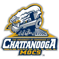
The mascot "Scrappy" in silver, white, gold and navy driving a train in navy and white on a gold background above the wordmark "THE UNIVERSITY OF TENNESSEE AT" in gold and "CHATTANOOGA" in white with a gold drop shadow and "MOCS" in gold on a navy background with a silver outline.
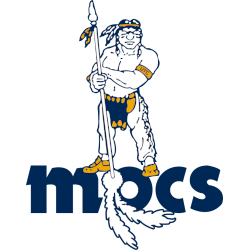
Chattanooga Mocs
1984 - 1997
A Native American in white, gold, and navy holding a spear in white, gold and navy and wearing a gold armband with a the initials "UTC" standing atop of a lowercase wordmark "Mocs" in navy with two feathers hang from the left side of the letter "O" in white with navy trim.
College Sports Fan Products


