
St. John's Red Storm
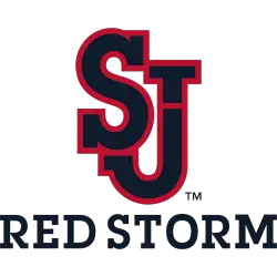
Red initials “SJ” with blue trim and a blue line across the letter “J.” They changed black to dark blue.
St. John's Red Storm
2015 - Present
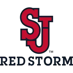
Red initials "SJ" with black trim and a black line across the letter "J." Wordmark "RED STORM" in black.
St. John's Red Storm
2015 - Present
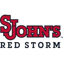
A wordmark "ST JOHN'S" in red with blue trim using the primary logo above the wordmark "RED STORM" in blue.
St. John's Red Storm
2015 - Present
Blue initials "SJ" with red trim and a red line across the letter "J."

St. John's Red Storm
2015 - Present
Blue initials "SJ" with red trim and a red line across the letter "J." Wordmark "RED STORM" in black.
St. John's Red Storm
2006 - 2015
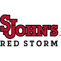
A wordmark "ST JOHN'S" in red with blue trim using the primary logo above the wordmark "RED STORM" in blue.
St. John's Red Storm
2006 - 2015
Blue initials "SJ" with red trim and a red line across the letter "J." Wordmark "RED STORM" in black.

St. John's Red Storm
1994 - 2003
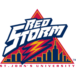
Wordmark "RED STORM" with a lighting bolt in the middle of the letter "O" over black with the yellow trim skyline in a red triangle and a red, yellow, and blue lightning bolt coming down in the middle.
St. John's Red Storm
1994 - 2003
A red and blue stallion on two legs with the initials "SJU" in white with blue background.

St. John's Red Storm
1994 - 2003
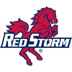
A red and blue stallion up on two legs with a wordmark "RED STORM" in white with blue formed background.
St. John's Red Storm
1994 - 2003
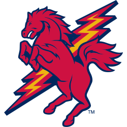
A red, yellow and blue lightning bolt in a diagonal angle with a red and blue stallion up on two legs.
St. John's Red Storm
1994 - 2003
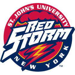
Wordmark "RED STORM" in white with blue highlights with red, yellow, and blue lighting, red and blue clouds in a red emblem with an encircled wordmark "ST. JOHN'S UNIVERSITY" in white and "NEW YORK" in white.
St. John's Red Storm
1979 - 2003
Interlocked letters "StJ" in blue.

St. John's Red Storm
1979 - 2003
Interlocked letters "StJ" in red with white and blue trim.
St. John's Red Storm Logo History
The St. John’s Red Storm Alternate Logo has seen several updates throughout the team’s history. Early versions were simple and bold, while modern designs feature sharper lines and updated typography. Each alternate logo complements the primary logo, enhancing the team’s branding across merchandise, media, and promotional platforms. Learn more about the team’s history on the St. John’s Red Storm Wikipedia page.
Studying the St. John’s Red Storm logo history helps understand the importance of alternate logos in maintaining a strong visual identity. These designs honor the team’s legacy while adapting to contemporary styles. Fans and media often use these alternate logos to represent St. John’s Red Storm in various contexts.
High-resolution St. John’s Red Storm logo PNG files are available for fans and digital media use. To explore all wordmark variations and designs, visit the St. John’s Red Storm Wordmark Logo Page.