St. John's Red Storm
Red initials “SJ” with blue trim and a blue line across the letter “J.” They changed black to dark blue.

St. John's Red Storm
2006 - 2015
Red initials "SJ" with black trim and a black line across the letter "J."

St. John's Red Storm
2003 - 2006
A red wordmark "ST. JOHN'S" with white and red trim.

St. John's Red Storm
1994 - 2003
Wordmark "RED STORM" in white with blue highlights with red, yellow, and blue lighting, red and blue clouds over blue with the yellow trim skyline in a red emblem with an encircled wordmark "ST. JOHN'S UNIVERSITY" in white.

St. John's Red Storm
1988 - 1994
Blue with white and blue outline initials "SJU" aligned diagonally with a scripted wordmark "Redmen" in red on an angle.
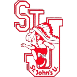
St. John's Red Storm
1974 - 1988
Staggered initials "STJ" in white with red trim with wordmark "St. Johns U" within the letter "J," behind a red and white Native American in action.
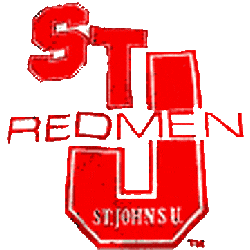
St. John's Red Storm
1965 - 1974
Red initials "STJ" with the letter "J" being larger and white trim and a wordmark "REDMEN" in red and "ST. JOHN'S U" in white at the bottom of the letter "J."
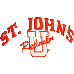
St. John's Red Storm
1950 - 1965
Arched wordmark "ST. JOHN'S in red over a white with red trim letter "U" with scripted "Redmen" in red.
St. John's Red Storm Logo History
The St. John’s Red Storm primary logo has gone through several changes that shaped the team’s branding. Early designs focused on strong lettering, while later versions added sharper outlines and cleaner forms. These updates highlight the long St. John’s Red Storm logo history, and more background details can be found on the team’s official Wikipedia page.
Each St. John’s Red Storm logo PNG included here presents the full visual timeline in crisp detail. The improvements in texture, spacing, and layout helped define the current St. John’s Red Storm primary logo. These refinements show how consistent upgrades strengthened the school’s overall identity across the years.
This complete record of the St. John’s Red Storm primary logo helps fans compare every style used throughout the program’s history. For additional elements, you can visit the St. John’s Red Storm Alternate Logo page to view more variations. Combined with the St. John’s Red Storm logo PNG set, it provides a full picture of the team’s long-standing branding journey.
College Sports Fan Products
