Chicago State Cougars
A side view of a cougar’s head in green with black highlights.
Chicago State Cougars
2007 - Present
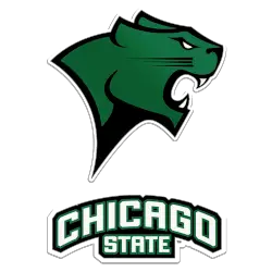
A side view of a cougar's head in green with black highlights above an arched wordmark "CHICAGO" in white with light green trim and "STATE" in white with light green trim all on a green with white trim background.
Chicago State Cougars
1974 - 2007
A side view of a cougar's head in white with green highlights with a big growl.

Chicago State Cougars Logo History
The Chicago State Cougars logo history includes several alternate logos created to support the primary brand. Early versions of the Chicago State Cougars alternate logo offered flexibility for uniforms and promotions. As a result, the designs worked well across different sports while maintaining a clear team identity.
Over time, the Chicago State Cougars alternate logo introduced updated shapes, colors, and layouts. Additionally, these changes improved visibility across digital and print platforms. Because of this, the Chicago State Cougars logo history shows steady refinement, while Chicago State Cougars logo PNG files became popular for media and fan use.
This page presents every official Chicago State Cougars alternate logo from start to present day. Each design represents a specific stage in the Chicago State Cougars logo history. For more background, visit Chicago State Cougars Wikipedia. You can also visit the Chicago State Cougars Wordmark Logo Page to compare alternate designs with official wordmarks.


