Eastern Michigan Eagles
A letter “E” in green.
Eagles Alternate Logo
The Eastern Michigan Eagles have had a long and storied history within the NCAA. From its first season in 1973 to its most recent championship win in 2018, the school has seen its fair share of successes on and off the court. One thing that many fans may not know about is the team's alternate logo history, which dates back nearly as far as its inception.
The original Eastern Michigan Eagles logo was created for use during home games in 1974 and featured an eagle head with wings spread wide over a blue circle with white trimming around it. The design was simple yet effective at conveying what this team stood for – strength, courage, pride, and determination to succeed no matter how difficult things got on or off the court. As time went by though, changes were made to reflect changing trends or simply personal preference among those creating these logos but they all still represented EMU’s core values of excellence through hard work and dedication regardless of any hardship faced along their journey towards greatness!
Over time there have been several different variations released including one featuring two eagles facing each other (1985-86), another featuring three stars above an eagle head (1986-87), and even one where only half an Eagle can be seen from behind clouds (1995). In 2004 however; after much deliberation amongst students/alumni/coaches etc., it was decided that none other than “the classic” should represent our beloved university going forward into future seasons! This decision led us back full circle to where we find ourselves today - proudly sporting our traditional logo across all apparel & merchandise-related items throughout campus life!
Despite some minor adjustments here & there since then; this iconic image remains synonymous with success both academically & athletically at EMU - reminding us all why we strive so hard every day: To become champions just like those before us who fought tooth & nail against adversity while representing our beloved institution proudly until victory could finally be found!
Eastern Michigan Eagles
2003 - 2012
A white and black eagle's head next to an initials "EMU" in green with white and black trim and "ATHLETICS" in white on a green background.
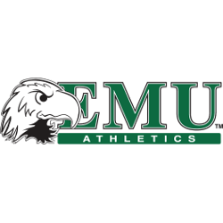
Eastern Michigan Eagles
2003 - 2012
A white and black eagle's head on a green oval above initials "EMU" in green with white and black trim and "ATHLETICS" in white on a green background.
Eastern Michigan Eagles
2002 - 2012
A letter "E" in green with a white and black trim.

Eastern Michigan Eagles
1995 - 2001
A letter "E" in green.
Moved to primary logo in 2002.

Eastern Michigan Eagles
1995 - 2001
A brown, black and yellow eagle with a letter "E" in green on a white background standing in front of initials "EMU" in green.
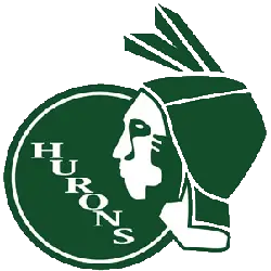
Eastern Michigan Hurons
1929 - 1990
A green and white Native American head with the wordmark "HURONS" is diagonally positioned on a green warrior's shield.
