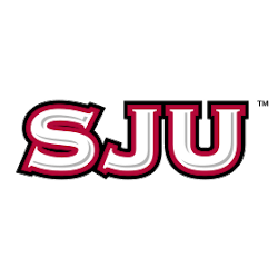
St. Joseph's Hawks
A high-flying red and black hawk. Former alternate logo.
St. Joseph's Hawks
2023 - Present
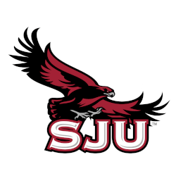
A side view of a red, grey, and black hawk above the initials "SJU" in white with red and black trim and silver highlights. The initials "SJU" represent St. Joseph's University.
A former primary logo.

St. Joseph's Hawks
2023 - Present
A cursive scripted wordmark "St. Joe`s" in red.

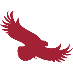
St. Joseph's Hawks
2017 - Present
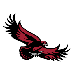
A high-flying red silhouette hawk.
St. Joseph's Hawks
2002 - Present
Initials "SJU" in white with red and black trim and silver highlights. The initials "SJU" represent St. Joseph's University.
St. Joseph's Hawks
2002 - 2023
A new update to the high-flying red and black hawk.
Slight changes to the maroon color in this version.
St. Joseph's Hawks
2002 - 2017
A side view of a red, grey, and black hawk above the initials "SJU" in white with red and black trim and silver highlights. The initials "SJU" represent St. Joseph's University.

St. Joseph's Hawks
2002 - 2017
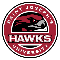
A side view of a red, grey, and black hawk inside a red with white and black trim circle and a wordmark “HAWKS” in white with red and black trim across the middle and “SAINT JOSEPH’S UNIVERSITY” encircled in white.
St. Joseph's Hawks
2002 - 2017
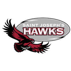
A high-flying red and black hawk below a grey with black trim bubble with a wordmark "SAINT JOSEPH'S" in white and "HAWKS" in white with red and black trim.
St. Joseph's Hawks
2002 - 2017
A high-flying red and black hawk above the initials "SJU" in white with red and black trim.
St. Joseph's Hawks
2002 - 2017
A high-flying red and black hawk below a black with black trim bubble with a wordmark "SAINT JOSEPH'S" in white and "HAWKS" in white with red and black trim.
St. Joseph's Hawks
2002 - 2017
A high flying red and black hawk above a wordmark "HAWKS" in white with red and black trim.
St. Joseph's Hawks
2002 - 2007
A side view of a red, grey, and black hawk above a wordmark "HAWKS" in white with red and black trim.
St. Joseph's Hawks
2002 - 2007
A high-flying red and black hawk above the initials "SJU" in white with red and black trim.
St. Joseph's Hawks
2002 - 2007
A high-flying red and black hawk below a red with black trim bubble with a wordmark "SAINT JOSEPH'S" in white and "HAWKS" in white with red and black trim.
St. Joseph's Hawks
2002 - 2007
A high-flying red and black hawk above a wordmark "HAWKS" in white with red and black trim.
St. Joseph's Hawks
2002 - 2007
A side view of a red, grey, and black hawk above a wordmark "HAWKS" in white with red and black trim.
St. Joseph's Hawks
2002 - 2007
A side view of a red, grey, and black hawk inside a red with white and black trim circle and a wordmark "HAWKS" in white with red and black trim across the middle and "SAINT JOSEPH'S UNIVERSITY" encircled in white.
St. Joseph's Hawks
2002 - 2007
Initials "SJU" in white with red and black trim and silver highlights. The initials "SJU" represent St. Joseph's University.
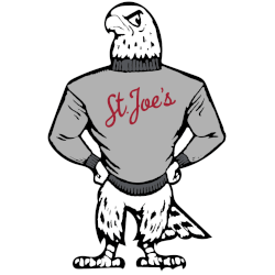
St. Joseph's Hawks
1982 - 1991
A standing grey and dark grey hawk with hands resting on the waist, wearing a grey sweater with a scripted wordmark "St Joe's."
St. Joseph's Hawks Logo History
The early St. Joseph’s Hawks alternate logo styles introduced bold shapes and simple graphics that helped define the look of St. Joseph Hawks basketball. These first designs remain important in the overall St. Joseph’s Hawks logo history. Fans can learn more about the team’s background by visiting the Saint Joseph’s University Wikipedia page.
As the team evolved, new versions of the St. Joseph’s Hawks alternate logo began to include stronger lines and more expressive artwork. These updates supported modern branding needs across St. Joseph Hawks basketball platforms. Each refreshed design adds to the long timeline of the St. Joseph’s Hawks logo history. You can also view related designs on our internal St. Joseph’s Hawks Wordmark logo page.
Recent St. Joseph’s Hawks logo designs bring polished typography and updated colors while holding onto familiar elements. These changes reflect both tradition and progress within St. Joseph Hawks basketball. Every new version adds another chapter to the St. Joseph’s Hawks logo history, helping maintain a strong and recognizable brand in all visual formats.