The Miami Hurricanes logo has always reflected the team’s fierce spirit and tradition. Through the years, the Miami Hurricanes logo history has featured several unique alternate designs, each capturing the identity of the University of Miami Hurricanes logo in its own way. These alternate logos add depth and color to the brand’s rich visual legacy.
Miami Hurricanes
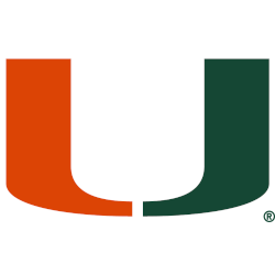
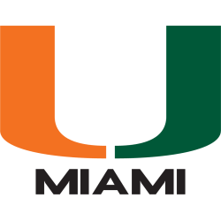
Split letter “U” with orange in the left half, green in the right half, and a white outline. A new shade of orange.
Miami Hurricanes
2024 - Present
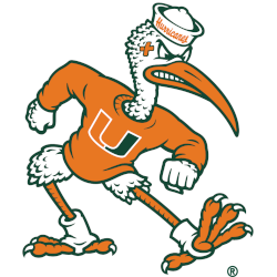
A scripted wordmark "Hurricanes" in orange on a white cap, the block letter "M" on the chest was changed to the primary "U" logo, and the ibis was made stronger appearing by buffing up his arms, given larger fists.
A new shade of orange.
Miami Hurricanes
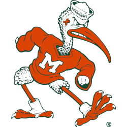
2019 - 2024
An orange, green, and white ibis with an orange sweatshirt with the letter "M" ready for a fight.
Sebastian the Ibis logo.
Miami Hurricanes
2000 - 2011
Stylized orange, white and grey flying ibis on top of a grey hurricane.

Miami Hurricanes
1997 - 2000
Split-U on hurricane eye spiral design in green and orange.

Miami Hurricanes
1991 - 2000
The letter "U" half in green and half in orange. A scripted wordmark "Hurricanes" in green below the letter "U."

Miami Hurricanes
1973 - 1993
The split letter "U" in green and orange above the wordmark "MIAMI" in black.
Miami Hurricanes
1973 - 1993
The Split-U design in green and orange with additional U-components upside down on the right forming a letter "M" thus appearing as UM short for "UNIVERSITY OF MIAMI" in black.

Miami Hurricanes
1949 - 1965
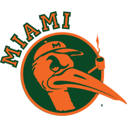
Orange Ibis head with pipe in a green circle with orange trim. Wordmark "MIAMI" off center.
Miami Hurricanes
1946 - 1964
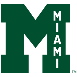
A letter "M" in green with a wordmark "MIAMI" on top of the letter "M" white and vertically positioned.
Miami Hurricanes
1940 - 1964
The letter "M" in green with orange trim. The letter "M" represents the city of Miami.
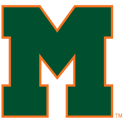
Miami Hurricanes
1926 - 1973
Sans serif block letter "M" in green.

Miami Hurricanes
1926 - 1973
The initials "U. of M." are in green.
University of Miami was then known as "The U."

Miami Hurricanes Logo History
The alternate versions of the Miami Hurricanes logo often highlight the creativity behind the team’s branding. From stylized “U” emblems to vintage hurricane-themed graphics, each design tells part of the story behind the Miami Hurricanes logo history. These variations have appeared on team gear, merchandise, and digital media, showing the evolution of the University of Miami Hurricanes logo over time. You can read more about the team’s full history on Wikipedia.
The Miami Hurricanes logo PNG files showcase detailed and modernized takes on the classic “U” icon. These alternate logos retain the team’s traditional orange and green colors but introduce fresh visual twists that appeal to fans. The design changes over time show how the University of Miami Hurricanes logo continues to stay relevant while honoring its past. For more designs, visit our Miami Hurricanes wordmark logo page.
Each alternate Miami Hurricanes logo variation adds personality to the brand’s identity. Whether used on helmets, uniforms, or official materials, these designs embody the team’s determination and pride. The Miami Hurricanes logo history proves how well the program balances tradition with innovation in its branding.