Mercer Bears
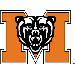
A bear’s head in black and white on a block letter “M” in orange with white and black trim.
Bears Alternate Logo
The history of Mercer Bears' alternate logos is a testament to the university's commitment to evolving its brand identity while honoring its storied legacy. Alternate logos serve the purpose of offering flexibility and variety in branding, allowing for different expressions of the Mercer Bears' spirit across various platforms and merchandise. The journey of these alternate logos reflects a blend of tradition and innovation, catering to the diverse tastes of fans, alumni, and the broader university community.
In the early stages, Mercer University's alternate logos were variations of the primary logo, often featuring simpler designs or different color schemes. These initial alternates were used to complement the primary logo, providing a fresh look while maintaining a strong connection to the university's core identity. This period saw the emergence of secondary marks that could be used in more casual or less formal contexts, ensuring that the Mercer brand remained versatile and dynamic.
As the branding strategy of collegiate athletics evolved, Mercer University introduced more distinct alternate logos that captured specific aspects of the Bears' identity. One notable alternate logo featured a stylized bear paw, symbolizing strength and determination while offering a more minimalist and modern design. This logo became popular for its sleek appearance and was often used on merchandise, team uniforms, and promotional materials. The bear paw logo resonated with fans and athletes alike, representing the fierce competitiveness and unity of Mercer Bears teams.
In recent years, Mercer has continued to innovate with its alternate logos, introducing designs that incorporate contemporary aesthetics while preserving the historical essence of the Bears. These modern alternates often include variations in typography, color palettes, and graphical elements, ensuring they are adaptable to various media and marketing needs. The most recent alternate logos reflect Mercer University's forward-thinking approach, combining tradition with a fresh, modern look that appeals to a new generation of fans. These logos play a crucial role in maintaining the brand's relevance and engagement, solidifying Mercer Bears' place in collegiate athletics.
Mercer Bears
2007 - Present
An arched wordmark "MERCER" in orange with white and black trim on a cream background and "BEARS" in white on a black background above a bear's head in black, and white.
Mercer Bears
2000 - Present
Initials "MU" in orange with black and white trim.
Mercer Bears
1993 - Present
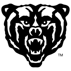
A front view of a bear's head in black and white.
