The Nottingham Forest logo has evolved over the decades, becoming an emblem deeply cherished by its fans. Each phase in its history reflects a moment and showcases the club's connection to Nottingham’s heritage and football legacy. This article delves into the rich history of Nottingham Forest's logo, examining its origins, redesigns, and role in fan culture.
Origins of the Nottingham Forest Emblem
Nottingham Forest’s logo has strong historical roots, shaped by symbols from Nottingham’s own story. These origins are a testament to the club’s pride in its locality and its connection to the city’s unique history.
Early Symbols and Inspirations
In its early years, Nottingham Forest had no official club logo but adopted symbols associated with Nottingham’s cultural heritage. The “Jolly Forester” symbol was one of the first, representing a connection to Sherwood Forest and the folklore of Robin Hood. This early imagery linked the club to Nottingham’s natural beauty and cultural legends, creating a base for what would eventually become the official emblem.
Adoption of the City Coat of Arms (1946–1974)

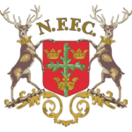
In 1946, Nottingham Forest adopted the city’s coat of arms as its emblem. This decision symbolized pride in Nottingham and its civic identity. The coat of arms featured a castle and oak branches, elements synonymous with the city. The coat of arms was used as the club’s logo for nearly three decades, cementing the connection between Nottingham Forest and its home city.
The 1973 Redesign Competition

The 1970s brought significant change, as Nottingham Forest sought to establish a unique identity separate from the city’s coat of arms. This period began the club’s most iconic emblem design, which is still recognized today.
Motivation for a New Identity
Nottingham Forest faced limitations due to copyright issues with the city’s coat of arms, which led the club to seek an original logo. In 1973, the club competed for a new design to create an emblem that could legally stand on its own while preserving elements of Nottingham’s natural and cultural heritage.
David Lewis's Winning Design
David Lewis, a graphic design lecturer at Trent Polytechnic, created the winning design. Lewis’s design showcased a simplified yet meaningful image: a stylized tree above wavy lines, symbolizing Sherwood Forest and the River Trent. This design was widely praised for its ability to capture the club’s heritage in a fresh, modern style. Since its adoption, it has become the emblem that fans proudly recognize and associate with Nottingham Forest.
Evolution of the Emblem (1974–Present)

Since its introduction, the David Lewis design has been unchanged, though minor adjustments have been made. This period reflects the club’s growing legacy and the logo’s deepening significance to its supporters.
Initial Adoption and Reception
The emblem was introduced to the public in 1974, and fans quickly embraced it. The new design became a powerful symbol of the club’s identity, resonating with players and supporters. The emblem’s reception was overwhelmingly positive, and it began to feature prominently on team kits, flags, and merchandise, making it a central element of the club’s visual identity.
Modifications Over the Years
The core design has remained consistent, but subtle updates have occurred. The most notable change came in the early 1980s when two stars were added above the emblem. These stars commemorate Nottingham Forest’s back-to-back European Cup victories in 1979 and 1980, a proud reminder of the club’s achievements. They also highlight the club’s success and inspire fans and players alike.
Symbolism and Design Elements
The Nottingham Forest logo is visually appealing and rich in symbolism. The elements chosen for the emblem reflect Nottingham’s history and environment; each design choice has meaning for the club and its supporters.
The Stylized Tree and River Motif
The stylized tree is a tribute to Sherwood Forest, symbolizing Nottingham’s natural heritage and folklore. Beneath the tree, wavy lines represent the River Trent, which flows through Nottingham and has always been a significant landmark. These elements form a logo embodying Nottingham Forest’s connection to its city and natural landscape, giving the emblem a timeless and meaningful design.
Color Scheme and Typography
The Nottingham Forest logo uses the club’s traditional colors of Garibaldi red and white, instantly recognizable to fans. The red represents the club’s passion and vigor, while the unique typography adds a personalized touch. The distinctive lowercase “e” in “Forest” is a subtle detail that makes the logo unique, reflecting the club’s individuality and tradition.
The Emblem's Role in Club Culture
Over the years, the Nottingham Forest emblem has become essential to the club culture. It deeply resonates with supporters and symbolizes the club's unity and pride.
Presence of Kits and Merchandise
The emblem is a central feature on team kits, hats, scarves, and countless other merchandise. Fans proudly wear the logo, and its presence on team apparel reinforces Nottingham Forest’s brand identity. Whether on the jerseys or the banners in the stadium, the emblem unites fans and players under a shared symbol, creating a visual link to the club’s heritage.
Fan Engagement and Identity
For Nottingham Forest supporters, the emblem represents much more than a logo. It has become a focal point of identity and loyalty, something fans associate with unforgettable moments and cherished memories. The emblem fosters a sense of belonging, strengthening the community of Nottingham Forest supporters who rally behind it season after season. For those exploring careers in sports or branding, platforms like JKCP provide valuable resources on career development and education, offering insights into the skills and pathways relevant to this field.
Comparative Analysis with Other Club Emblems
Nottingham Forest’s logo is distinctive in its simplicity and symbolism, setting it apart from the emblems of many other football clubs. This section examines how the Forest logo compares to other club emblems and fits broader football design trends.
Unique Features of Nottingham Forest's Emblem
Unlike many club emblems with elaborate crests or multiple symbols, the Nottingham Forest logo is notably simple. Its emphasis on nature—a tree and river—is uncommon among football emblems, giving it a unique identity that immediately sets it apart. This minimalist design has allowed it to endure for decades without feeling outdated.
Trends in Football Emblem Design
The trend in football emblem design has increasingly leaned towards minimalism and simplicity, aiming for instantly recognizable and versatile designs across media. Nottingham Forest was ahead of its time with this approach, as its design from 1973 already embodies these principles. Today, many clubs are redesigning their logos to align with Nottingham Forest’s style. Still, the Forest logo stands out as one of the original examples of effective, minimalist branding in sports.
Summing-Up
The Nottingham Forest logo is more than just an emblem; it symbolizes history, pride, and community. From the early “Jolly Forester” symbol to the enduring design created by David Lewis, each emblem version reflects a connection to Nottingham’s heritage and the fans’ unwavering loyalty. Through its simplicity and symbolic depth, the Nottingham Forest logo has become a timeless icon in the football world, continuing to inspire players and supporters alike.

