Saint Louis Billikens
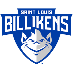
On a blue shield, a wordmark “SAINT LOUIS” in white at the top and “BILLIKENS” below. A front view of a white and grey with the blue trim troll. Former alternate logo.
Billikens Alternate Logo
As one of the most storied programs in college basketball, the Saint Louis Billikens have had a long and celebrated history. As part of this tradition, they’ve also had an interesting array of alternate logos over the years. In this blog post, we’ll take a look at some notable examples from their past to see how far they’ve come since first introducing their iconic logo back in 1927.
The very first alternate logo for Saint Louis was introduced during the 1980s and featured a classic cartoon-style Billiken with his arms crossed wearing blue shorts and shoes along with yellow gloves and socks. This particular design was used until 1988 when it was replaced by another more modern version featuring him standing upright while wearing red pants instead of shorts as well as white sneakers instead of yellow socks & gloves. The last major change came in 1993 when they switched out both colors for black ones which would remain until 2001 before being retired altogether due to declining popularity among fans (and players).
From there, several other designs were experimented with including an abstract “S” shape inside a shield that could be seen on t-shirts & hats starting around 2004; however, these never caught on either so eventually, it too got phased out after just two seasons (2006–2007). Afterward, no new logos were adopted but rather existing ones were simply modified slightly such as changing up color combinations like adding navy or gray accents here & there throughout the 2008–2011 period before finally settling into what is now known today – namely keeping things simple yet recognizable using only three primary colors: red/white/black plus occasional touches gold if necessary!
Overall then while some may argue that having multiple versions isn't always necessary nor beneficial overall it's still nice knowing that even though times change certain traditions can remain intact - especially those associated with beloved teams like SLU's own Billikens who've proudly worn different looks over decades without ever losing sight what matters most: winning games!
Saint Louis Billikens
2022 - Present
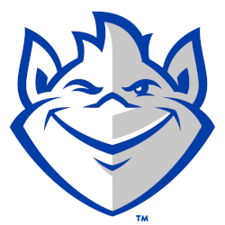
A front view of a white and grey with the blue trim troll.
A former primary logo.
Saint Louis Billikens
2015 - Present
Initials "SLU" in white on top of a blue shield with white stripes. Two rows of stars with 4 stars on top and 6 stars on bottom in blue.
Saint Louis Billikens
2015 - 2022
On a blue shield, a wordmark "SAINT LOUIS" in white at the top and "BILLIKENS" below. A front view of a white and grey with a blue trim troll.
Moved to the primary logo.
Saint Louis Billikens
1984 - 2015
A front view of a white and grey with blue trim troll winking.

Saint Louis Billikens
1970 - 1984
A front view of a white and grey with blue trim troll winking and wearing a crown with the initials "SLU." Wordmark "Saint Louis University" in blue on top and "BILLIKENS" in blue on the bottom.
Saint Louis Billikens
1965 - 1970
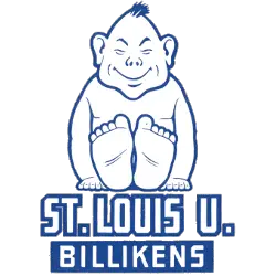
Feet first white with blue trim sitting troll above a wordmark "ST. LOUIS U." in white with blue trim and "BILLIKENS" in white on a blue background.
