SE Missouri State Redhawks
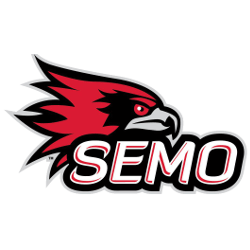
New in 2020, a side view of a red, black and grey redhawk’s head on top of the initials “SEMO” in white with red highlights on a black background.
Redhawks Wordmark Logo
The Southeast Missouri State Redhawks are a proud member of the NCAA Division I athletics program. The Redhawks have been part of the Ohio Valley Conference since 1991 and their wordmark logo has become synonymous with success in college sports.
The history of the SE Missouri State Redhawks wordmark logo dates back to 1984 when it was designed by alumnus and former football player John McQueary. The design features an eagle perched atop a red shield with “SEMO” written across it in white letters. Below this is an arc that reads “RedHawks” which is also written in white lettering on a black background. This iconic design has remained unchanged for over thirty years, making it one of the most recognizable logos among NCAA teams today.
In addition to its long-standing presence within collegiate sports, this symbol has come to represent more than just athletic prowess; It stands as a source of pride for students, alumni, and fans alike who proudly wear or display their colors wherever they go! As such, there are many different types of merchandise featuring this timeless icon including apparel items like t-shirts and hats as well as collectible memorabilia such as mugs or keychains - all bearing witness to SEMO's rich heritage both on and off campus!

SE Missouri State Redhawks
2020 - Present
Initials "SEMO" in white with red highlights and a wordmark "REDHAWKS" in grey on a black background.
Font: Diavlo Bold
https://www.onlinewebfonts.com/download/aaadcee8cdc66fe74b5438f47f576ff5

SE Missouri State Redhawks
2020 - Present
Initials "SEMO" in white with red highlights on a black background.
Font: Diavlo Bold
https://www.onlinewebfonts.com/download/aaadcee8cdc66fe74b5438f47f576ff5

SE Missouri State Redhawks
2020 - Present
Initials "SEMO" in red with white highlights and a wordmark "REDHAWKS" in grey on a black background.
Font: Diavlo Bold
https://www.onlinewebfonts.com/download/aaadcee8cdc66fe74b5438f47f576ff5

SE Missouri State Redhawks
2020 - Present
Initials "SEMO" in red with white highlights on a black background.
Font: Diavlo Bold
https://www.onlinewebfonts.com/download/aaadcee8cdc66fe74b5438f47f576ff5

SE Missouri State Redhawks
2003 - 2020
Red with white trim initials "SE" above a wordmark "MISSOURI STATE" in white all on a formed black background with an arched bottom.
Font: Unknown

SE Missouri State Redhawks
2003 - 2020
Wordmark "SOUTHEAST MISSOURI" in white on a black background and "REDHAWKS" in red with white trim on a black background.
Font: Unknown

SE Missouri State Redhawks
2003 - 2020
Wordmark "REDHAWKS" in red with white trim on a black background.
Font: Unknown

SE Missouri State Redhawks
2003 - 2020
Initials "SEMO" in red with white and black trim.
Font: Unknown

