In the changing landscape of sports branding, NBA teams frequently update their logos to remain current, engage fans, and exhibit an evolving identity. Such logo redesigns can spark enthusiastic approval or doubtful glances from spectators and experts in equal measure. We will now examine some of the most significant and notable modifications made to NBA team logos in recent history.
The Best
Denver Nuggets
 After competing for 47 years without a championship win, the Nuggets finally won the NBA title. Although everyone is happy about their 2023 victory, which has made news all over the basketball world, winning could have inspired them to change their logo during this time of achievement. The new brand design helped refresh how people perceived the team and encouraged more fan support. This new emblem brought a contemporary touch to the team's image and matched well with its successful period marked by playoff appearances. The fans and any top online sportsbook site would have been surprised too. They may have been a joke to many, but these changes impacted how people viewed them.
Milwaukee Bucks
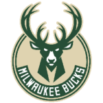 The Milwaukee Bucks underwent a logo redesign in 2015, marking a fresh era for the team. This transformation was in line with the rise of superstar Giannis Antetokounmpo taking center stage. The new design, which is smooth and modern, perfectly captures the spirit of Bucks' revived feeling. It received appreciation from supporters and those who love design as well. Just as the team improved in games, this new look also helped to strengthen their image as a powerful challenger within the league.
Brooklyn Nets
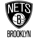 When the Brooklyn Nets introduced their new logo in 2012, it symbolized change, as they had relocated from New Jersey to Brooklyn. The design is simple but strong and connects with the team's urban style. It shows dynamic energy, as we see in the city they now call home. Additionally, the smooth black-and-white color combination conveys an impression of elegance and a contemporary look, forming the perfect foundation for the Nets' successful rebranding story both on and off the basketball court.
The Worst
Los Angeles Clippers
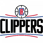
The Los Angeles Clippers' logo, released in 2015, was not well received by fans and received much criticism. The design was seen as dull, lacking any unique characteristics to represent either the team or the city of Los Angeles. This led many people to question why they had chosen such an uninspiring change. The failure of this rebranding attempt highlights how the Clippers missed an opportunity to establish a distinct image compared to other basketball teams within LA's competitive environment.
Atlanta Hawks
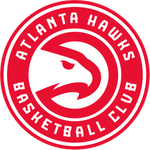 In 2015, the Atlanta Hawks showed a new logo that was not liked by many fans. The design of this logo, with its complex details and puzzling elements, did not make a substantial impact as it was hard to understand its meaning. This failure in creating connections or having an impact can be seen in how many people didn't respond well to this attempt at rebranding themselves, which highlights the importance of simplicity and unity in effective branding strategies.
Cleveland Cavaliers
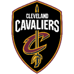 The 2017 Cleveland Cavaliers logo redesign was not particularly impressive, as it lacked originality and innovative ideas. The slight alterations to the old design were barely noticeable, failing to create a clear separation between the old and new logos. This left fans unenthusiastic and uninspired by what they saw as an opportunity for a fresh life in the Cavaliers' branding. This situation showed a mismatch between the team's goals and how they presented themselves visually on this occasion, which desperately needed to change. Fans expressed their lack of enthusiasm for these alterations, highlighting that there had been a missed opportunity to revitalize the team's branding efforts.
Ultimately, redesigning a logo may help elevate a team's brand to new success, or it could be seen as an attempt that falls short of its goal. The triumph of these redesigns is often dependent on their ability to accurately represent the true nature and character of the squad, foster connections with fans, and convey the active energy of sport. While NBA teams constantly change and grow, branding remains crucial for shaping their identity and maintaining fan loyalty.
She Didn’t Even Know the WNBA… Then Caitlin Clark Happens
Subscribe to Our YouTube Channel
