


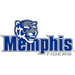
Memphis Tigers
Wordmark "Memphis" in blue with a white and grey trim and "TIGERS" in grey below with a the tigers' head above.

North Texas Mean Green
Double lined wordmark "MEAN GREEN" in green with white and black trim.


South Florida Bulls
Wordmark "BULLS" in green with white and gold trim with the Bull's primary logo as the letter "U."

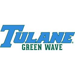
Tulane Green Wave
Wordmark "TULANE" in blue with green trim and "GREEN WAVE" in green.


UAB Blazers
Diagonal scripted wordmark "Blazers" with tail in green with gold trim and a flame at the end of the tail.

"School Spirit Never Graduates"
From the first kickoff to the Final Four, your colors represent a lifetime of memories. Celebrate the traditions that define your campus and rep your alma mater with officially licensed gear for every season.
Shop the Official NCAA Collection







American Athletic Conference Logo History
Early versions of the American Athletic Conference logo featured a clean serif wordmark paired with a simple star symbol. Over time, the AAC logo adopted sharper lines and stronger typography to highlight the conference’s competitive identity. These updates created a modern look that represents all American Athletic teams. More variations of team graphics can be found on our Conference Primary Logo page.
Later redesigns of the American Athletic Conference logo focused on improving clarity across digital platforms and broadcast media. The enhanced AAC logo used bolder strokes and refined spacing to strengthen visibility in national coverage while maintaining consistency for all American Athletic teams. Fans can learn more about the league on the official American Athletic Conference Wikipedia page.
The current styling of the American Athletic Conference logo delivers a sharp, modern appearance that reflects the league’s growth and athletic strength. The AAC logo remains widely used in media guides, uniforms, and promotional material for American Athletic teams. Its updated wordmark provides a clean, professional visual that unifies the conference’s branding across all sports programs.