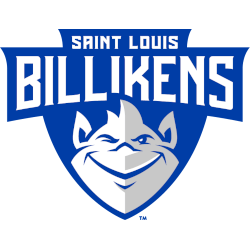
Saint Louis Billikens
On a blue shield, a wordmark “SAINT LOUIS” in white at the top and “BILLIKENS” below. A front view of a white and grey with the blue trim troll.
Former alternate logo.
Billikens Wordmark Logo
The Saint Louis Billikens have a rich history that dates back to the early 1900s. The team's iconic wordmark logo has been around since 1929, and it is one of the most recognizable logos in college sports today.
The original design was created by cartoonist John Baur, who also designed other popular mascots like the San Diego Chicken and Stanford Tree. The name "Billiken" comes from an art-deco style figurine called a “Blessed Billiken” which was believed to bring good luck to its owner. This unique mascot fits perfectly with St Louis' reputation as a city of champions at the time, so it made sense for them to adopt this moniker for their athletic teams
Since then, there have been several iterations of the logo over time but all variations feature some combination of blue and white colors with yellow accents on top or bottom half circles representing eyes or horns above two letter S's intertwining together forming an abstract shape resembling a billy goat - hence why they are known as "the Billy Goats". In addition, some versions include stars within each letter while others do not; this detail changes depending on where you look!
Regardless of minor differences between designs throughout history though – one thing remains constant: every iteration proudly displays St Louis' signature arch symbolizing its strong connection both past & present with Gateway City culture & heritage – making it instantly recognizable even when seen from afar!
So whether you're cheering them on during the game day at Chaifetz Arena or simply taking in their timeless visual identity – just remember: no matter what version appears before your eyes…it will always be unmistakably Saint Louis through & through!

Saint Louis Billikens
2015 - Present
A wordmark "SAINT LOUIS" in white and "BILLIKENS" slightly arched in white with a blue formed background.
Font: Unknown
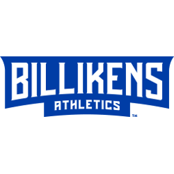
Saint Louis Billikens
2015 - Present
A wordmark “BILLIKENS” slightly arched in white and “ATHLETICS” in white with a blue formed background.
Font: Unknown

Saint Louis Billikens
2015 - Present
Slightly arched initials "SLU" in white on a blue formed background.
Font: Unknown
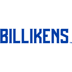
Saint Louis Billikens
2015 - Present
Wordmark "BILLIKENS" in blue.
Font: Unknown
Saint Louis Billikens
2015 - Present
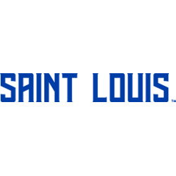
Wordmark "SAINT LOUIS" in blue.
Font: Unknown

Saint Louis Billikens
2015 - Present
Wordmark "BILLIKENS" in blue and "ATHLETICS" below and in blue.
Font: Unknown

Saint Louis Billikens
2015 - Present
Slightly arched initials "SLU" in blue.
Font: Unknown

Saint Louis Billikens
2009 - 2015
Diagonally connected initials "SLU" in blue with white and blue trim.
Font: Unknown
Saint Louis Billikens
2004 - 2015
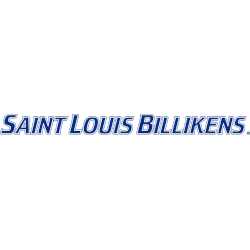
Wordmark "SAINT LOUIS BILLIKENS" in blue with white and blue trim.
Font: Unknown
Saint Louis Billikens
2004 - 2015
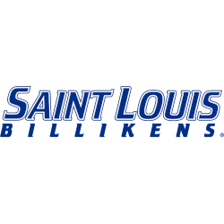
Double-lined wordmark "SAINT LOUIS" in blue with white and blue trim and "BILLIKENS" in blue.
Font: Unknown
Saint Louis Billikens
2004 - 2015
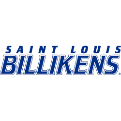
Double-lined wordmark "SAINT LOUIS" in blue and "BILLIKENS" in blue with white and blue trim.
Font: Unknown

Saint Louis Billikens
2004 - 2015
Initials "SLU" in blue with white and blue trim.
Font: Unknown

Saint Louis Billikens
2004 - 2015
Wordmark "BILLIKENS ATHLETICS" in blue with white and blue trim.
Font: Unknown

Saint Louis Billikens
2004 - 2009
Diagonally initials "SLU" in blue with white and blue trim.
Font: Unknown