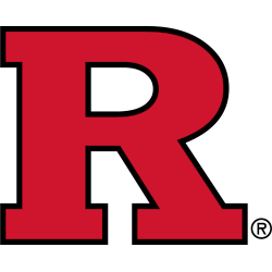
Rutgers Scarlet Knights
A red letter “R” with black trim.
A new shade of red.
Scarlet Knights Wordmark Logo
The Rutgers Scarlet Knights wordmark logo is a symbol of pride and tradition for the university. It has been used by the school since its founding in 1766, but it wasn’t until 1984 that an official version was adopted. The original design featured a shield with two crossed swords and a knight’s helmet on top, while today’s version includes just the knight's helmet over “Rutgers University.”
In 1994, Rutgers updated their logo to include more modern elements such as bolder colors and sharper edges to better reflect their status as one of New Jersey's premier universities. This new look included brighter red hues along with black trim around each letter in “Rutgers University." Additionally, they added white stars above both words which represented excellence – something all students strive for during their college experience at Rutgers.
Today, the Scarlet Knights' wordmark logo continues to be proudly displayed across campus from banners hung outside buildings or printed onto t-shirts worn by students who are proud members of this prestigious institution! From its classic origins to present-day updates; this iconic emblem will continue representing Rutgers well into future generations!

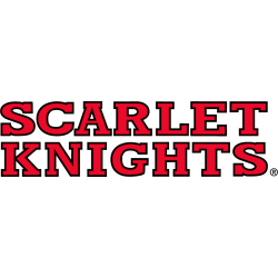
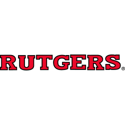
Rutgers Scarlet Knights
2016 - Present
A wordmark "RUTGERS" in red.
Font: Scarlet Knights font
https://www.whatfontis.com/FB_Scarlet-Knights.font
Rutgers Scarlet Knights
2001 - 2016
Double lined wordmark "SCARLET KNIGHTS" in red with black trim.
Font: Custom
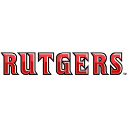
Rutgers Scarlet Knights
2001 - 2016
Single lined wordmark "RUTGERS" in red with black trim.
Font: Custom
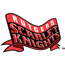
Rutgers Scarlet Knights
1997 - 2001
Triple lined wordmark "RUTGERS" in white on top and "SCARLET KNIGHTS" in red with white highlights on a red and black banner.
Font: Custom
Rutgers Scarlet Knights
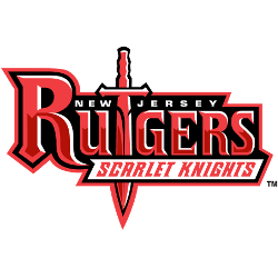
1997 - 2001
Wordmark "NEW JERSEY" in white on top. A sword positioned to form the letter "T" in the red wordmark "RUTGERS" and "SCARLET KNIGHTS" below in red on a white banner.
Font: Custom

Rutgers Scarlet Knights
1997 - 2001
Wordmark "NEW JERSEY" in white on top. A red wordmark "RUTGERS" and "SCARLET KNIGHTS" below in red on a white banner.
Font: Custom
Rutgers Scarlet Knights
1997 - 2001
Single lined wordmark "RUTGERS" in red with black trim.
Font: Custom