

Central Connecticut Blue Devils
A triple lined wordmark "CENTRAL" in white and "CONNECTICUT" in grey with a white and grey trident and "BLUE DEVILS" in grey all on a blue formed background.

Chicago State Cougars
An arched wordmark "CHICAGO" in white with light green trim and "STATE" in white with light green trim and a wordmark "COUGARS" in white on a green banner.
Fairleigh Dickinson Knights
Knights wordmark in burgundy. The font that makes up the tall letters uses straight characters and sharp edges, intended to represent both the iconic roof of the Rothman Center and battle armor.

Le Moyne Dolphins
A wordmark "LE MOYNE" with a slanted letters in green with white, gold, and green trim above the wordmark "DOLPHINS" in green.
Mercyhurst Lakers
A double-lined wordmark "MERCYHURST LAKERS" in green with white trim on a blue formed background above a clover leaf next to a disproportionate line as an underscore.

New Haven Chargers
A wordmark "NEW HAVEN" in blue with gold trim.
A new shade of gold.
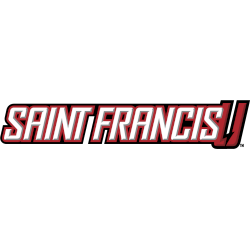
Saint Francis Red Wolves
A wordmark "SAINT FRANCIS" in white with silver highlights on two formed backgrounds in red and black, and next to the letter "U" in red with black trim and a lightning bolt.

Stonehill Skyhawks
A wordmark STONEHILL" in purple with white trim and "SKYHAWKS" in white on a black background. In the wordmark "STONEHILL" has a plane propeller as the letter "O."

Wagner Seahawks
A double-lined wordmark "WAGNER" in white with grey trim on a green formed background and "SEAHAWKS" in green.
"School Spirit Never Graduates"
From the first kickoff to the Final Four, your colors represent a lifetime of memories. Celebrate the traditions that define your campus and rep your alma mater with officially licensed gear for every season.
Shop the Official NCAA Collection







Northeast Conference Logo History
The Northeast Conference logo first appeared as simple wordmark designs. Early layouts focused on clear text and balance. As a result, the NEC logo history shows wordmarks that worked well across schedules, media guides, and signage. These designs helped unify Northeast Conference teams under one league identity.
Over time, the Northeast Conference logo wordmarks adopted cleaner spacing and stronger lettering. Additionally, updates improved digital use. Because of this, the NEC logo history reflects steady refinement. Modern wordmarks continue to support consistency for all Northeast Conference teams.
This page features every official Northeast Conference logo wordmark used from start to present day. Each version marks a clear stage in the Northeast Conference logo history. For league background, visit Northeast Conference history page. You can also visit the Northeast Conference Primary Logo Page to compare wordmarks with primary logos.