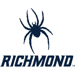
Richmond Spiders
A blue silhouette of an eight-legged spider with a wordmark below “RICHMOND” in blue.
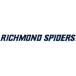
Richmond Spiders
2017 - Present
A wordmark "RICHMOND SPIDERS" in blue.
Font: Custom

Richmond Spiders
2002 - 2017
A blue spider silhouette between vertical wordmark "RICHMOND SPIDERS" in blue with red trim.
Font: Custom
Richmond Spiders
2002 - 2017
Wordmark "RICHMOND" in blue with red trim and "SPIDERS" in a custom red font.
Font: Custom
Richmond Spiders
2002 - 2017
Wordmark "SPIDERS" in a custom red font.
Font: Custom
Richmond Spiders
2002 - 2017
Wordmark "RICHMOND" in blue with red trim.
Font: Custom
Richmond Spiders Logo History
Early versions of the Richmond Spiders Wordmark logo featured simple lettering that matched the team’s classic look. As the program evolved, the Wordmark began adopting sharper strokes, adding more character and presence. To compare these changes with the main emblem, visit the Richmond Spiders primary logo page, which also connects to the complete Richmond Spiders logo history.
Later updates introduced more defined typography to give the Richmond Spiders Wordmark logo a stronger identity across uniforms and media graphics. These refinements aligned with branding trends at the time, resulting in more polished Richmond Spiders logo PNG versions. For additional background on the team and its evolution, you can check the University of Richmond Wikipedia page.
Recent years brought a modern, confident Richmond Spiders Wordmark logo, focusing on clean spacing and enhanced readability. Bringing all variations together helps you follow each transition within the broader Richmond Spiders logo history, offering a complete look at how the Wordmark developed from its earliest designs to the present.
College Sports Fan Products