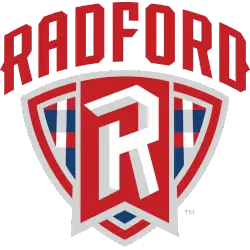
Radford Highlanders
In a custom font arched across the front a wordmark “RADFORD” in red above a shield shape with a large stylized letter “R” in the center and placed inside a red flag with the lower half of the shield is filled with a geometric pattern in red, blue, and white.
Radford Highlanders
2016 - Present
A custom letter "R" in white with silver highlights on a red with silver trim hanging banner in front of a plaid shield all in red, white and blue next to a wordmark "RADFORD HIGHLANDERS" in red.
Font: Custom
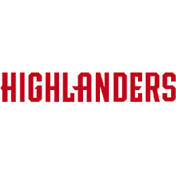
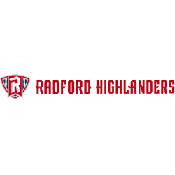
Radford Highlanders
2016 - Present
A wordmark "HIGHLANDERS" in red.
Font: Custom
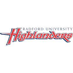
Radford Highlanders
2008 - 2015
A wordmark "RADFORD UNIVERSITY" in black on top of a custom wordmark "Highlanders" in red with white and black trim.
Font: Custom
Radford Highlanders Logo History
The Radford Highlanders Wordmark logo emphasizes clarity and balance. Earlier versions relied on straightforward lettering. Over time, updates refined spacing, weight, and alignment. These changes improved visibility across uniforms, signage, and digital media while preserving the school’s athletic identity.
As part of the broader Radford Highlanders logo history, each Wordmark revision aligns with institutional branding goals. Some designs were introduced alongside updates to the Radford University new logo. For visual comparison, you can visit the Radford Highlanders Primary Logo page to see how the marks work together.
This collection includes all approved Wordmark logos from start to present day. Every Radford Highlanders Wordmark logo shown here reflects official usage standards. For more historical and athletic background, refer to the university’s profile on Wikipedia.