Radford Highlanders
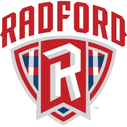
In a custom font arched across the front a wordmark “RADFORD” in red above a shield shape with a large stylized letter “R” in the center and placed inside a red flag with the lower half of the shield is filled with a geometric pattern in red, blue, and white.
Radford Highlanders
2008 - 2016
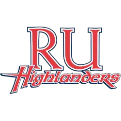
The initials "RU" in red with white and black outline over a custom wordmark "HIGHLANDERS" in red with white and black outline.
Radford Highlanders
2000 - 2008
The initials "RU" in red with white and black outline over the wordmark "HIGHLANDERS" in black.

Radford Highlanders
1994 - 2000
The wordmark "Highlanders" arched above a highlander swinging a sword in red, black and tan.
Radford Highlanders Logo History
The Radford Highlanders Primary logo represents the university across athletics, merchandise, and official media. Over the years, design refinements improved balance and legibility. A detailed overview of the Radford Highlanders logo history is available on the Radford Highlanders Wikipedia page. Alternate designs are shown on the Radford Highlanders Alternate logo page.
Although visual details changed, the Radford Highlanders Primary logo maintained consistent colors and symbols. These updates aligned the branding with modern standards. Reviewing the Radford University new logo shows how the program adapted while staying connected to its athletic tradition.
This archive presents every official Radford Highlanders Primary logo in chronological order. Each image marks a specific phase in the Radford Highlanders logo history. Together, they provide a clear visual timeline from the program’s earliest marks to the present day.
College Sports Fan Products

Vote Now / All Highlanders Fans!!
The Radford Highlanders logo is battle-forged fury. A regal Scottish warrior in bold red and white, kilt flowing and claymore raised, radiates unbreakable strength, ancient heritage, and fearless Highland charge. This isn't a mascot—it's a clansman ready to storm the gates.
In the Big South logo battle, every rival emblem looks soft next to this indomitable warrior dominating the Dedmon Center. Nothing else carries the same raw endurance, intimidating presence, and warrior spirit. The Radford Highlanders logo stands unchallenged as the most formidable and awe-inspiring in the conference. Sound the pipes and charge forward, Highlanders nation!


