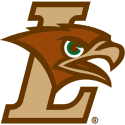
Lehigh Mountain Hawks
A dark brown, light brown, green, and white mountain hawk’s head on light brown with dark brown trim letter “L.”
Lehigh Mountain Hawks
2003 - Present
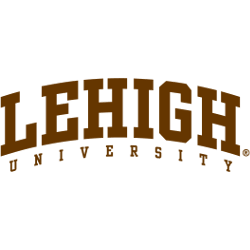
Arched wordmark "LEHIGH" in dark brown with white and dark brown trim and "UNIVERSITY" in dark brown.
Font: Unknown
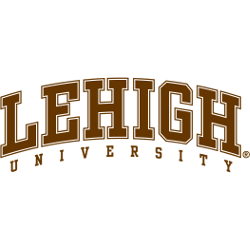
Lehigh Mountain Hawks
2003 - Present
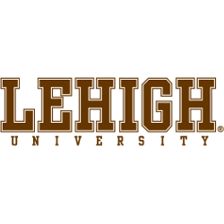
Wordmark "LEHIGH" in dark brown with white and dark brown trim and "UNIVERSITY" in dark brown.
Font: Unknown
Lehigh Mountain Hawks
2003 - Present
Arched wordmark "LEHIGH" in dark brown and "UNIVERSITY" in dark brown.
Font: Unknown
Lehigh Mountain Hawks
2003 - Present
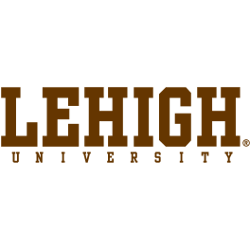
Wordmark "LEHIGH" in dark brown and "UNIVERSITY" in dark brown.
Font: Unknown
Lehigh Mountain Hawks Logo History
The Lehigh Mountain Hawks wordmark logo has always been central to the team’s identity. Throughout the Lehigh Mountain Hawks logo history, designers refined fonts and spacing. As a result, each version became easier to read while staying connected to the original Lehigh Hawk logo.
Over the years, different wordmark styles appeared on uniforms and media. However, each design still aligns with the wider Lehigh Mountain Hawks logo history. For more details on the program and athletics, visit the Lehigh Mountain Hawks History page.
This collection includes every Lehigh Mountain Hawks wordmark logo from early designs to the present day. Together, they show steady visual growth. To see how these wordmarks pair with the main emblem, visit the internal Lehigh Mountain Hawks Primary Logo page for a complete brand overview.