Towson Tigers
A slanted custom wordmark “TOWSON” in white on a black background with grey trim is above a side view of a tiger’s head with mouth wide open in black, white, grey, and gold. Created by a local agency, MGH Advertising.

Towson Tigers
2011 - Present
A wordmark "TOWSON" in white on a black background with gold trim.
Font: Custom
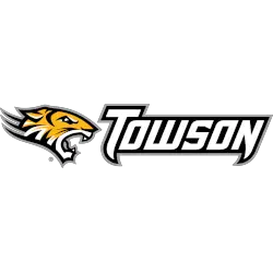
Towson Tigers
2011 - Present
A side-view of a tiger's head with mouth wide open in black, white, grey, and gold beside wordmark "TOWSON" in white with black trim.
Font: Custom

Towson Tigers
2011 - Present
A side-view of a tiger's head with mouth wide open in black, white, grey, and gold beside wordmark "TOWSON TIGERS" in white with black trim.
Font: Custom

Towson Tigers
2002 - 2011
A side-view of a tiger's head with mouth wide open in black, white, grey, and gold beside wordmark "TOWSON" in black with grey trim.
Font: Custom

Towson Tigers
2002 - 2011
A side-view of a tiger's head with mouth wide open in black, white, grey, and gold beside wordmark "TOWSON TIGERS" in black with grey trim.
Font: Custom
Towson Tigers Logo History
Throughout the Towson Tigers logo history, wordmark logos supported clear and consistent branding. Each Towson Tigers Wordmark logo focused on strong lettering and proper spacing. As a result, every Towson Tigers logo PNG remained easy to read on uniforms, schedules, and official materials.
Later stages of the Towson Tigers logo history introduced refined typography and alignment. These changes improved visibility on digital platforms. However, each Towson Tigers Wordmark logo continued to reflect the program’s bold athletic identity. Learn more on Wikipedia.
Today, this archive presents the complete Towson Tigers logo history for wordmark designs. Every Towson Tigers Wordmark logo appears from start to today. Fans reviewing each Towson Tigers logo PNG can also visit Towson Tigers Primary Logo Page to explore official primary branding.


