The New Hampshire Wildcats logo history features several versions of the New Hampshire Wildcats Wordmark logo, each helping shape the program’s identity. These designs also influenced how the New Hampshire Football Logo developed over time. This page highlights every major style shift and explains how the Wildcats created a steady look that remains strong across all eras.
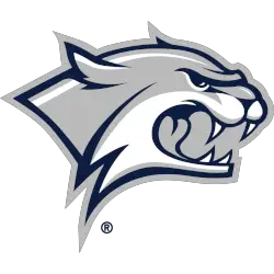
New Hampshire Wildcats
A right-facing and growling wildcat’s head in blue, white, and gray.
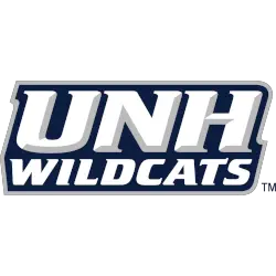
New Hampshire Wildcats
2000 - Present
Initials "UNH" above a wordmark "WILDCATS" in white with grey highlights on a blue with grey outline background.
Font: Unknown

New Hampshire Wildcats
2000 - Present
Initials "UNH" in white with grey highlights on a blue with grey outline background.
Font: Unknown
New Hampshire Wildcats
2000 - 2019
A wildcat's head in grey, white and blue with an arched wordmark "NEW HAMPSHIRE WILDCATS" around the wildcat in white with blue trim.
Font: Unknown
New Hampshire Wildcats
2000 - 2019
A wordmark "NEW HAMPSHIRE" in white with grey highlights on a blue with grey outline background.
Font: Unknown
New Hampshire Wildcats Logo History
The New Hampshire Wildcats Wordmark logo saw many updates as the school refined its branding. Each version supported the long-term style documented in the New Hampshire Wildcats logo history, which continues to guide modern design choices. You can explore more historical details on the official New Hampshire Wildcats Wikipedia page.
Over the years, the team improved spacing, lettering, and sharpness in the New Hampshire Wildcats Wordmark logo, making it easier to use across uniforms and media. These changes also shaped how the New Hampshire Football Logo looks today, strengthening recognition. For comparisons with other designs, visit our internal New Hampshire Wildcats Primary Logo page.
The modern New Hampshire Wildcats Wordmark logo strikes a clean balance between tradition and updated typography. This improvement matches trends seen throughout the New Hampshire Wildcats logo history, helping fans follow each design step. Because of these changes, the New Hampshire Football Logo and Wordmark now share a consistent and polished identity.


