Nevada Wolf Pack
An electric looking wolf attacking in blue with a wordmark “NEVADA” above in blue.
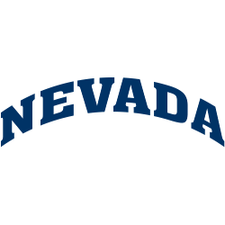
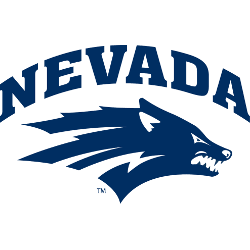
Nevada Wolf Pack
2008 - Present
Wordmark "NEVADA" arched in blue.
Font: Unknown
Nevada Wolf Pack Logo History
The Nevada Wolf Pack logo history begins with simple wordmark designs that focused on clarity. Early lettering styles were bold and easy to read. Because of this, the old Nevada Wolf Pack logo worked well on uniforms and printed materials. However, spacing and font weight were refined as branding standards improved.
Over time, the Nevada Wolf Pack wordmark logo adopted cleaner lines and balanced proportions. As a result, the wordmarks looked more consistent across digital and athletic platforms. Additionally, designers preserved key elements from the old Nevada Wolf Pack logo to maintain tradition while improving visual impact.
This page includes every official Nevada Wolf Pack wordmark logo from start to present day. Each design represents a key phase in the Nevada Wolf Pack logo history. For more background, visit Nevada Wolf Pack Wikipedia. You can also visit Nevada Wolf Pack Primary Logo Page to see how wordmarks align with primary logos.
College Sports Fan Products