Nebraska-Omaha Mavericks
An interlocked letter “O” with a red letter “O” and a black letter “U” interlocked to create the letter “O.”
Nebraska-Omaha Mavericks
2011 - Present
A wordmark "MAVERICKS" with an arched bottom in black.
Font: Unknown
Nebraska-Omaha Mavericks
2011 - Present
A wordmark "MAVERICKS" with an arched bottom in red.
Font: Unknown
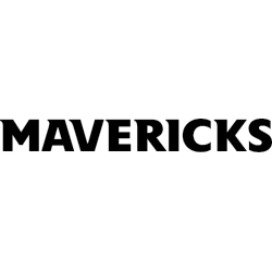
Nebraska-Omaha Mavericks
2011 - Present
A wordmark "MAVERICKS" in black.
Font: Unknown
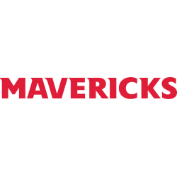
Nebraska-Omaha Mavericks
2011 - Present
A wordmark "MAVERICKS" in red.
Font: Unknown
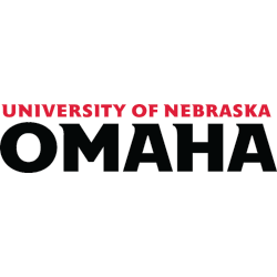
Nebraska-Omaha Mavericks
2011 - Present
A wordmark "UNIVERSITY OF NEBRASKA" in red and "OMAHA" in black.
Font: Unknown
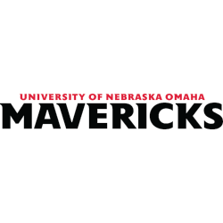
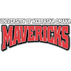
Nebraska-Omaha Mavericks
2011 - Present
A wordmark "UNIVERSITY OF NEBRASKA OMAHA" in red and "MAVERICKS" in black.
Font: Unknown
Nebraska-Omaha Mavericks
1997 - 2004
A wordmark "UNIVERSITY OF NEBRASKA OMAHA" in white with black trim and "MAVERICKS" with a arch bottom in red with white and black trim.
Font: Custom
Nebraska-Omaha Mavericks logo history
The Nebraska-Omaha Mavericks logo history highlights a steady transition toward clean and modern wordmark designs. Early versions of the UNO Mavericks wordmark logo focused on bold lettering and balance. Over time, the Omaha Mavericks logo was refined to improve readability while maintaining strong institutional recognition across multiple sports.
As branding standards evolved, the UNO Mavericks wordmark logo became central to the program’s visual identity. Each update within the Nebraska-Omaha Mavericks logo history emphasized consistency and versatility. For broader athletic background, visit the Nebraska-Omaha Mavericks History page. You can also explore related branding on our Nebraska-Omaha Mavericks Primary Logo page.
College Sports Fan Products