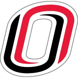
Nebraska-Omaha Mavericks
An interlocked letter “O” with a red letter “O” and a black letter “U” interlocked to create the letter “O.”
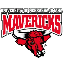
Nebraska-Omaha Mavericks
2004 - 2011
Wordmark "UNIVERSITY OF NEBRASKA OMAHA" in white with black trim above a bottom arched "MAVERICKS" in red with a white and black trim formed background and a bulls head in red, black and white.
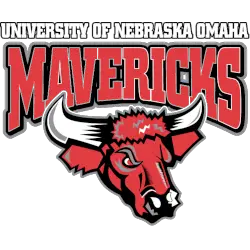
Nebraska-Omaha Mavericks
1997 - 2004
Wordmark "UNIVERSITY OF NEBRASKA OMAHA" in white with black trim above a bottom arched "MAVERICKS" in red with a black formed background and a bulls head in red, black and white.
Nebraska-Omaha Mavericks Logo Evolution
The Nebraska-Omaha Mavericks primary logo emphasizes strength, motion, and athletic tradition. Early designs focused on bold lettering and simple motifs to ensure clarity. Over time, the UNO Mavericks primary logo was refined with modern typography, sharper lines, and adaptable colors, maintaining its distinctiveness across digital, print, and merchandise formats.
Throughout the Nebraska-Omaha Mavericks logo history, the primary logo has served as the foundation for UNO’s visual identity. Official Omaha Mavericks logo files helped standardize the branding across all Summit League teams. The logo continues to unite fans and athletes while representing the university’s competitive spirit. For more details, visit the official Nebraska-Omaha Mavericks History page.
Today, the Nebraska-Omaha Mavericks primary logo pairs seamlessly with alternate and secondary marks while retaining strong recognition. Explore our UNO Mavericks Alternate Logo page to see complementary designs used alongside the main logo.
College Sports Fan Products


Vote Now / All Mavericks Fans!!
As a Nebraska-Omaha Mavericks fan, it is easy to admire the spirit of independence and daring reflected in the Mavericks logo. Featuring a bold bull, the emblem represents courage, innovation, and athletic excellence—qualities that define the University of Nebraska at Omaha’s competitive identity. Among Summit League logos, the Mavericks logo stands out for how clearly it conveys boldness, determination, and team pride.
The name “Mavericks” symbolizes unyielding independence, fearless daring, and a relentless drive to succeed. This gives the logo lasting impact, making it a unifying symbol for fans and athletes alike. Compared to other team logos, few inspire the same level of respect and admiration. In any logo battle, the Nebraska-Omaha Mavericks logo remains a powerful emblem of courage and audacity.