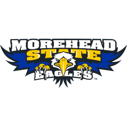
Morehead State Eagles
A front view of a blue, white, yellow, and black eagle with an above wordmark “MOREHEAD” in white with black trim, “STATE” in yellow with black trim, and below “EAGLES” in white with black trim.
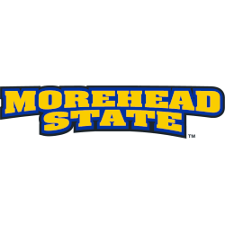
Morehead State Eagles
2005 - Present
A wordmark "MOREHEAD STATE" in yellow on a blue-formed background.
Font: Unknown
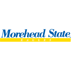
Morehead State Eagles
1994 - 2000
A wordmark "Morehead State" serif text in blue above "EAGLES" in white inside the yellow background.
Font: Serif
Morehead State Eagles Logo History
The Morehead State Eagles wordmark logo has changed gradually over the years. Early designs focused on clear lettering and balance. Later updates refined fonts and spacing. Each Morehead State football logo supported these changes, while the overall Morehead State Eagles logo history remained consistent for fans and media.
Over time, the Morehead State Eagles wordmark logo became more versatile. As a result, each Morehead State football logo works well across digital media and apparel. These updates helped modernize the Morehead State Eagles logo history without losing recognition or brand clarity.
Today, every Morehead State Eagles wordmark logo aligns with the university’s athletic identity. Meanwhile, the Morehead State football logo supports consistency across platforms. For official details, visit Morehead State Eagles history or view the Morehead State Eagles Primary Logo Page to compare related designs.