Middle Tennessee Blue Raiders
Connected initials “MT” in blue with white and black trim and a black and grey flying horse with a lightning bolt coming out of his mouth. A new shade of blue is added.
Middle Tennessee Blue Raiders
2019 - Present
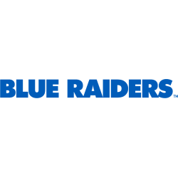
Wordmark "BLUE RAIDERS" in blue.
Font: Unknown
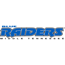
Middle Tennessee Blue Raiders
2015 - 2019
Triple lined wordmark "BLUE" in blue on top, "RAIDERS" in blue with white trim on a black formed background and "MIDDLE TENNESSEE" in black on the bottom.
A new shade of blue is added.
Font: Custom

Middle Tennessee Blue Raiders
1998 - 2015
Triple lined wordmark "BLUE" in blue on top, "RAIDERS" in blue with white trim on a black formed background and "MIDDLE TENNESSEE" in black on the bottom.
Font: Custom
Middle Tennessee Blue Raiders Logo History
The Middle Tennessee Blue Raiders Wordmark logo plays a key role in the overall Blue Raiders logo history. Over the years, designers refined typography and spacing. However, the wordmark always supported brand recognition across athletics. More historical background is available on the Wikipedia page of Middle Tennessee Blue Raiders.
As branding standards changed, the Middle Tennessee Blue Raiders Wordmark logo also became more polished. Therefore, modern versions use cleaner lettering and improved balance. Each update still connects visually to earlier designs. All versions appear here as part of the official Middle Tennessee logo collection documenting the Blue Raiders logo history.
Although this page focuses on wordmarks, they work closely with the team’s main emblem. For that reason, visit Middle Tennessee Blue Raiders Primary Logo Page to view the complete identity. Together, the primary mark and Middle Tennessee Blue Raiders Wordmark logo complete the visual story shown throughout the Blue Raiders logo history from start to present.
College Sports Fan Products