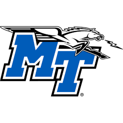
Middle Tennessee Blue Raiders
Connected initials “MT” in blue with white and black trim and a black and grey flying horse with a lightning bolt coming out of his mouth. A new shade of blue is added.

Middle Tennessee Blue Raiders
2015 - 2019
Connected initials "MT" in blue with white and black trim and a black and grey flying horse with a lightning bolt coming out of his mouth.
Color change on the shade of blue.

Middle Tennessee Blue Raiders
1998 - 2015
Connected initials "MT" in blue with white and black trim and a black and grey flying horse with a lightning bolt coming out of his mouth.
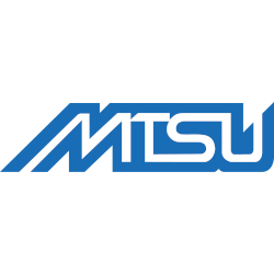
Middle Tennessee Blue Raiders
1975 - 1998
Initials "MTSU" in blue with white highlights in the center of the letters.
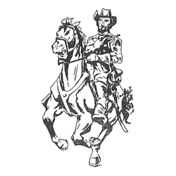
Middle Tennessee Blue Raiders
1945 - 1975
Symbol of General Nathan Bedford Forrest on a horse.
Middle Tennessee Blue Raiders Logo History
Early chapters of the Middle Tennessee Blue Raiders logo history focused on bold Blue Raider imagery. Each Middle Tennessee Blue Raiders Primary logo emphasized strength and balance. As a result, the official Middle Tennessee logo became easy to recognize across uniforms and athletic branding.
Later updates in the Middle Tennessee Blue Raiders logo history refined outlines and spacing. These changes improved clarity for digital and broadcast use. However, each Middle Tennessee Blue Raiders Primary logo continued to reflect the team’s competitive identity. Learn more on Wikipedia.
Today, this archive presents the complete Middle Tennessee Blue Raiders logo history for primary designs. Every Middle Tennessee Blue Raiders Primary logo appears from start to today. Fans reviewing the official Middle Tennessee logo can also visit Middle Tennessee Blue Raiders Alternate Logo Page to explore alternate branding.
College Sports Fan Products


Vote Now / All Blue Raiders Fans!!
As a proud Middle Tennessee Blue Raiders fan, I urge you to recognize the boldness and tradition behind this logo. The Blue Raiders emblem features a fearless raider that represents courage, confidence, and athletic pride. Among Conference USA logos, it stands out for its daring identity.
Moreover, the name “Blue Raiders” reflects toughness, ambition, and competitive drive. It captures the pursuit of victory with fearless intent. While other logos feel less adventurous, this one commands respect. For that reason, the Middle Tennessee Blue Raiders logo deserves your support in this logo battle.
Click to go to C-USA Logo Battle and vote


