Michigan Wolverines
A yellow block letter “M.” The letter “M” represents the state of Michigan. Again a new shade of yellow.
Michigan Wolverines
2016 - Present
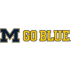
The Michigan letter "M" in blue with yellow outline next to wordmark "GO BLUE" in yellow with blue trim.
A new shade of yellow.
Font: Custom

Michigan Wolverines
2016 - Present
Single lined wordmark arched "MICHIGAN" in blue with yellow trim.
A new shade of Yellow.
Font: Custom
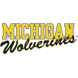
Michigan Wolverines
2016 - Present
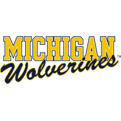
Wordmark "MICHIGAN" in yellow with blue trim and below is an angled scripted wordmark "Wolverines" in blue with yellow trim.
A new shade of yellow.
Font: Custom
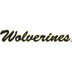
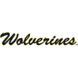
Michigan Wolverines
2016 - Present
Single lined scripted wordmark "Wolverines" in blue with yellow trim.
A new shade of yellow.
Font: Custom

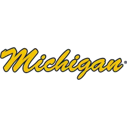
Michigan Wolverines
2016 - Present
Single lined scripted wordmark "Michigan" in blue with yellow trim.
A new shade of yellow.
Font: Custom

Michigan Wolverines
2016 - Present
Wordmark "MICHIGAN" in yellow with blue trim.
Font: Custom
Michigan Wolverines
2016 - Present
Single lined scripted wordmark "Wolverines" in yellow with blue trim.
A new shade of yellow.
Font: Custom
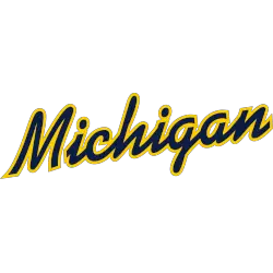
Michigan Wolverines
2016 - Present
Single lined scripted wordmark "Michigan" in yellow with blue trim.
Font: Custom
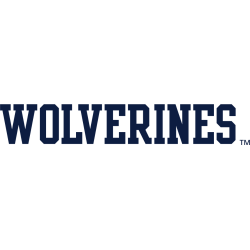
Michigan Wolverines
1994 - Present
Wordmark "WOLVERINES" in blue.
Font: Custom

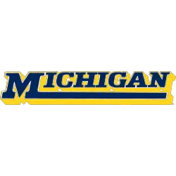
Michigan Wolverines
1994 - Present
Wordmark "MICHIGAN" in blue.
Font: Custom

Michigan Wolverines
1994 - 2016
Single lined wordmark arched "MICHIGAN" in blue with yellow trim.
Font: Custom

Michigan Wolverines
1994 - 2016
Single lined wordmark "MICHIGAN" in yellow with blue trim.
Font: Custom
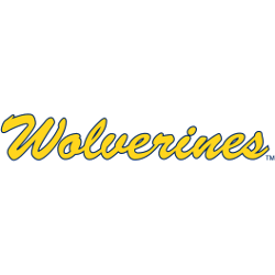
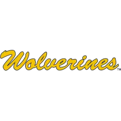
Michigan Wolverines
1994 - 2016
Single lined scripted wordmark "Wolverines" in yellow with blue trim.
Font: Custom
Michigan Wolverines
1994 - 2016
Single lined scripted wordmark "Wolverines" in blue with yellow trim.
Font: Custom
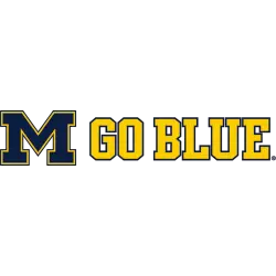
Michigan Wolverines
1994 - 2016
The Michigan letter "M" in blue with yellow outline next to wordmark "GO BLUE" in yellow with blue trim.
Font: Custom
Michigan Wolverines
1994 - 2016
Wordmark "MICHIGAN" in yellow with blue trim and below is an angled scripted wordmark "Wolverines" in blue with yellow trim.
Font: Custom

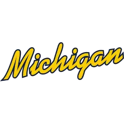
Michigan Wolverines
1994 - 2016
Single lined scripted wordmark "Michigan" in blue with yellow trim.
Font: Custom

Michigan Wolverines
1994 - 2013
Wordmark "MICHIGAN" in yellow.
Font: Custom
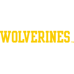
Michigan Wolverines
1994 - 2013
Wordmark "WOLVERINES" in yellow.
Font: Custom
Michigan Wolverines
1994 - 2000
Angled scripted wordmark "Michigan" in yellow with blue trim.
Font: Custom
Michigan Wolverines
1994 - 2000
Angled scripted wordmark "Michigan" in blue with yellow trim.
Font: Custom
Michigan Wolverines
1975 - 1994
Wordmark "MICHIGAN" with a tail across the bottom from the letter block "M" in blue with a formed yellow background.
Font: Custom

Michigan Wolverines
1961 - 1994
Wordmark "UNIVERSITY OF" in blue above "MICHIGAN" with the Michigan letter "M" in yellow with blue trim.
Font: Custom
Michigan Wolverines Logo History
Every Michigan Wolverines Wordmark logo represents a distinct stage within the broader Michigan Wolverines logo history. Early designs relied on bold, traditional lettering, while later versions adopted cleaner spacing and a more modern look. These updates reveal how the identity evolved through typography. For more historical details about the program, fans can visit the team’s Wikipedia page, which provides additional background.
Many styles were influenced by the University of Michigan Wolverines logo, especially in the balance between shape and spacing. Each Michigan Wolverines Wordmark logo highlights changes that helped refine the team’s visual presence. These gradual adjustments show how the brand adapted over time. To compare these wordmarks with the main emblem, you can visit the Michigan Wolverines primary logo page for all primary marks.
Seeing all Michigan Wolverines Wordmark logo variations together helps illustrate the full Michigan Wolverines logo history. Some versions held onto classic themes, while others introduced sharper, updated typography. These designs show how the brand progressed from early lettering styles to modern wordmark forms. This archive preserves every version, ensuring a complete record from the oldest designs to today’s recognizable marks.