
Illinois State Redbirds
A aggressive looking cardinal in red, black and yellow next to wordmark “ILLINOIS STATE” in red with white highlights above “REDBIRDS” in white on black background.

Illinois State Redbirds
2018 - Present
Arched wordmark "ILLINOIS STATE" in white with red highlights.
Font: Custom
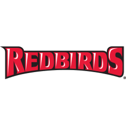
Illinois State Redbirds
2005 - Present
A wordmark "REDBIRD" in red with white highlights on a black formed background.
Font: Custom

Illinois State Redbirds
2005 - 2018
An arched wordmark “ILLINOIS STATE” in red with white highlights on a black formed background.
Font: Custom
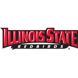
Illinois State Redbirds
2005 - 2018
A arched wordmark "ILLINOIS STATE" in red with white highlights above "REDBIRDS" in white on black banner background.
Font: Custom

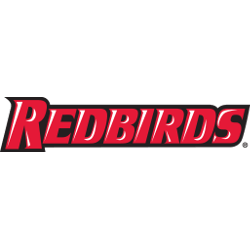
Illinois State Redbirds
2005 - 2018
Wordmark "ILLINOIS STATE" in red with white highlights above "REDBIRDS" in white on black banner background.
Font: Custom
Illinois State Redbirds
2005 - 2018
A arched wordmark "REDBIRD" in red with white highlights on a black formed background.
Font: Custom
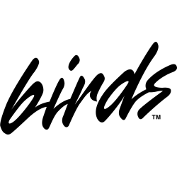
Illinois State Redbirds
1996 - 2005
A slanted wordmark scripted "birds" in black.
Font: Custom
Illinois State Redbirds
1996 - 2005
A wordmark "ILLINOIS STATE" in black with a red line above and below with scripted "Redbirds" in black.
Font: Custom
Illinois State Redbirds
1996 - 2005
A slanted wordmark scripted "Redbirds" in black.
Font: Custom
Illinois State Redbirds Logo History
Early Illinois State Redbirds wordmark logo designs emphasized clear lettering and strong alignment. Because of this, the text stayed easy to read. These wordmarks appeared on uniforms and publications. As a result, the Illinois State Redbirds logo history expanded beyond graphic symbols.
Over time, the Illinois State Redbirds wordmark logo adopted cleaner fonts and improved spacing. Therefore, each Illinois State Redbirds logo PNG became easier to use across media. Still, familiar letter shapes remained. This helped maintain continuity within the Illinois State Redbirds logo history.
Today, the Illinois State Redbirds wordmark logo appears across digital platforms and official branding. Meanwhile, these designs support clarity and flexibility. As a result, the Illinois State Redbirds logo history remains strong and consistent. For official team background, visit Illinois State Redbirds Wikipedia. You can also visit the Illinois State Redbirds primary logo page to compare symbol-based designs.