Fordham Rams
A angled front view of a grey, white and black ram’s head next to a letter “F” in red on a grey background with white and black trim.
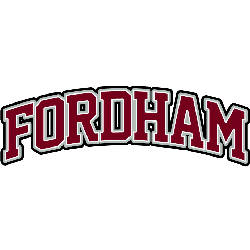
Fordham Rams
2008 - Present
A arched wordmark "FORDHAM" in red with white and black trim.
Font: Custom
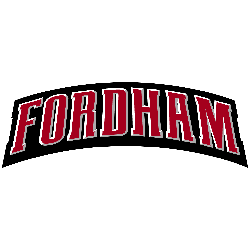
Fordham Rams
2001 - 2007
A arched wordmark "FORDHAM" in red with white trim on a formed black background.
Font: Custom
Fordham Rams Logo History
The Fordham Rams Wordmark logo has gone through several refinements as the school adjusted its branding to better match modern athletics. Early versions used serif lettering, while later designs adopted bold strokes and sharper lines. These changes created a stronger and more competitive look. You can compare these updates while exploring the program’s full primary marks on our Fordham Rams primary logo page, which pairs well with the Fordham logo PNG files included here.
Over time, the team continued improving the typography to give the logos more energy and readability. Transitional updates introduced cleaner spacing and improved shapes, which helped the Wordmark match the modern tone of college sports. Fans who want more context behind these changes can learn about the program on the Fordham Rams Wikipedia page for additional background. These redesigned versions also contribute significantly to the complete Fordham Rams logo history, showcasing how the school blends tradition with modern design.
The current Wordmark uses a confident style that reflects the team’s competitive attitude while remaining faithful to the school’s roots. This blend of old and new is what makes each Fordham Rams Wordmark logo memorable. With the detailed visuals on this page and the available Fordham logo PNG downloads, visitors can easily follow every major shift in the team’s branding from its earliest identity to the present day.