Saint Peter's Peacocks
A redesigned attitude peacock in blue and white with three crest feathers symbolized the holy trinity found on the University seal.
Peacocks Wordmark Logo
The history of the Saint Peter's Peacocks wordmark logo offers a captivating study in the art of sports branding. This particular type of logo, which primarily or exclusively uses text, plays a crucial role in creating a distinctive and memorable visual identity for the athletic program.
The earliest version of the Peacocks' wordmark logo dates back to the mid-20th century. This initial design featured the university's name and the term "Peacocks" in a simple, straightforward typeface. This minimalist approach focused on clarity and readability, ensuring that the logo would be instantly recognizable to fans and opponents alike.
As the university's athletic program grew and evolved, so did the wordmark logo. In the late 20th century, the logo underwent a significant redesign. The new version retained the original elements but introduced a more stylized and impactful typeface. This change represented a shift towards a more assertive and dynamic visual identity, reflecting the heightened competitiveness and ambition of the Peacocks' athletic teams.
The current iteration of the Peacocks' wordmark logo, introduced in the early 21st century, combines the traditional elements of the original design with a modern twist. The university's name and the word "Peacocks" are rendered in a bold, contemporary typeface, conveying a sense of energy and forward momentum. The inclusion of a stylized peacock feather in the design cleverly ties the wordmark logo to the visual imagery of the primary and alternate logos, creating a cohesive branding strategy.
In sum, the evolution of the Saint Peter's Peacocks wordmark logo is a testament to the power of typography in sports branding. Each redesign has sought to visually articulate the spirit and ambition of the Peacocks, while also adapting to changing design trends and the university's branding needs. The history of the Peacocks' wordmark logo is, thus, a fascinating narrative of typographical evolution, reflecting the athletic program's journey through the decades.

Saint Peter's Peacocks
2020 - Present
A wordmark "PEACOCK NATION" in blue.
Font: Custom
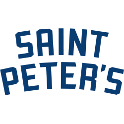
Saint Peter's Peacocks
2020 - Present
An arched wordmark "SAINT PETER'S" in blue.
Font: Custom
Saint Peter's Peacocks
2020 - Present
A wordmark "SAINT PETER'S" in blue.
Font: Custom
Saint Peter's Peacocks
2020 - Present
A custom scripted wordmark "Saint Peter's" in blue.
Font: Custom

Saint Peter's Peacocks
2020 - Present
A wordmark "PEACOCKS" in blue.
Font: Custom

Saint Peter's Peacocks
2020 - Present
A scripted wordmark "Peacocks" in blue.
Font: Custom

Saint Peter's Peacocks
2012 - 2020
A wordmark "SAINT PETER'S" in white with blue highlights and blue trim on a black background and "PEACOCK NATION" in white on a blue with black trim ribbon banner.
Font: Custom
Saint Peter's Peacocks
2012 - 2020
A wordmark "SAINT PETER'S" in white with blue highlights and blue trim on a black background and "UNIVERSITY" in white on a blue with black trim ribbon banner.
Font: Custom
Saint Peter's Peacocks
2003 - 2012
A wordmark "SAINT PETER'S" in white with blue highlights and blue and green trim on a black background and "PEACOCKS" in white on a blue with black trim ribbon banner.
Font: Custom
Saint Peter's Peacocks
2003 - 2012
A wordmark "SAINT PETER'S" in white with blue highlights and blue and green trim on a black background and "COLLEGE" in white on a blue with black trim ribbon banner.
Font: Custom
Saint Peter's Peacocks
2003 - 2012
A wordmark "SAINT PETER'S" in white with blue highlights and blue and green trim on a black background and "PEAHENS" in white on a blue with black trim ribbon banner.
Font: Custom


