Saint Peter's Peacocks
A redesigned attitude peacock in blue and white with three crest feathers symbolized the holy trinity found on the University seal.
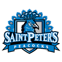
Saint Peter's Peacocks
2012 - 2020
A peacock's head with his plume of feathers in blue, white and black in front of a shield in grey, white, blue and black with the wordmark "SAINT PETER'S" in white with blue highlights and blue trim on a black background and "PEACOCKS" in white on a blue with black trim ribbon banner.
A new shade of blue and removed the green.
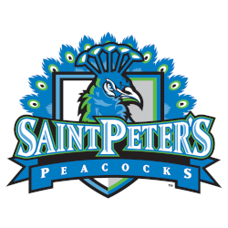
Saint Peter's Peacocks
2003 - 2012
A peacock's head with his plume of feathers in blue, white, green and black in front of a shield in grey, white, green, blue and black with the wordmark "SAINT PETER'S" in white with blue highlights and blue and green trim on a black background and "PEACOCKS" in white on a blue with black trim ribbon banner.
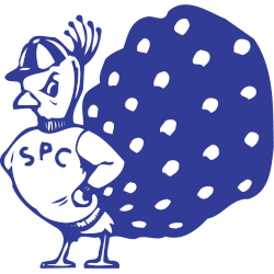
Saint Peter's Peacocks
1982 - 2003
A peacock in blue and white wearing a beanie in blue and white and wearing a white sweater with arched initials "SPC" across the chest and has its hands on its hips.
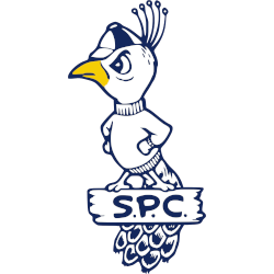
Saint Peter's Peacocks
1965 - 1982
Left-facing strutting peacock in white and gold with blue highlights wearing a beanie in blue and white, hands on hips, and standing on a log in white with blue highlights with the initials "S.P.C." and feathers hanging behind the log.
Saint Peter’s Peacocks Logo History
The Saint Peter’s Peacocks primary logo anchors the program’s visual identity. Across the Saint Peter’s Peacocks logo history, designers refined shapes and balance. As a result, the Saint Peter’s Peacocks logo stayed clear on uniforms and digital media. More background appears on Peacocks Wikipedia.
Rather than frequent redesigns, the Saint Peter’s Peacocks primary logo evolved through measured updates. Therefore, changes focused on legibility and modern use. These refinements strengthened the Saint Peter’s Peacocks logo history while keeping familiarity with the established Saint Peter’s Peacocks logo.
While this page highlights primary branding, alternate designs also support the identity. For that reason, visit the Saint Peter’s Peacocks Alternate Logo Page to review secondary marks. Together, alternates and the Saint Peter’s Peacocks primary logo present a complete visual record of the Saint Peter’s Peacocks logo history from start to present.
College Sports Fan Products

Vote Now / All Peacocks Fans!!
As a proud Saint Peter’s Peacocks fan, I urge you to recognize the elegance and confidence behind this logo. The Peacocks emblem features a poised peacock that represents style, pride, and athletic excellence. Among MAAC logos, it stands out for its grace and distinctive identity.
Moreover, the name “Peacocks” reflects confidence, flair, and competitive drive. It captures poise and the pursuit of victory. While other logos feel less refined, this one commands respect. For that reason, the Saint Peter’s Peacocks logo deserves your support in this logo battle.


