Quinnipiac Bobcats
A bobcat’s head is in gold, white, and blue inside a roundel with the encircled wordmark “QUINNIPIAC” in blue surrounded by a blue outline.

Quinnipiac Bobcats
2017 - Present
A custom wordmark "Quinnipiac" and "BOBCATS" in navy.
Font: Custom

Quinnipiac Bobcats
2017 - Present
A custom wordmark "Quinnipiac" and "ATHLETICS" in navy.
Font: Custom

Quinnipiac Bobcats
2017 - Present
An arched wordmark "QUINNIPIAC" in navy.
Font: Custom
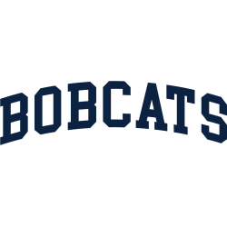
Quinnipiac Bobcats
2017 - Present
An arched wordmark "BOBCATS" in navy.
Font: Custom

Quinnipiac Bobcats
2017 - Present
A wordmark "QUINNIPIAC" in navy.
Font: Custom
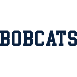
Quinnipiac Bobcats
2017 - Present
A wordmark "BOBCATS" in navy.
Font: Custom

Quinnipiac Bobcats
2002 - 2017
A bobcat's paw print in navy with gold trim above the wordmark "QUINNIPIAC" in navy with gold trim and "BOBCATS" in gold.
Font: Custom

Quinnipiac Bobcats
2002 - 2017
A leaping spotted bobcat in gold, navy, red and white next to the wordmark "QUINNIPIAC" in white on a navy background with gold trim and "ATHLETICS" in navy on a white background with gold trim.
Font: Custom

Quinnipiac Bobcats
2002 - 2017
An arched wordmark "QUINNIPIAC" in blue with gold trim below is a front view of a bobcat's head in gold, navy, red, and white and above the wordmark "ATHLETICS" in white on red button.
Font: Custom

Quinnipiac Bobcats
2002 - 2017
A leaping spotted bobcat in gold, navy, red and white next to the wordmark "QUINNIPIAC" in navy with gold trim and "BOBCATS" in navy.
Font: Custom

Quinnipiac Bobcats
2002 - 2017
A leaping spotted bobcat in gold, navy, red and white next to the wordmark "QUINNIPIAC" in navy with gold trim and "ATHLETICS" in navy.
Font: Custom
Quinnipiac Bobcats Logo History
The Quinnipiac Bobcats logo history reflects a clean and readable lettering style. Early wordmarks used simple fonts with minimal detail. However, later Quinnipiac Bobcats Wordmark logo updates improved spacing and balance. As a result, each Quinnipiac Bobcats logo PNG stays clear across uniforms and digital platforms.
Over time, the Quinnipiac Bobcats Wordmark logo maintained a steady visual identity. While font styles evolved, the overall look remained familiar. Moreover, this Quinnipiac Bobcats logo history shows careful refinement instead of major changes. Each Quinnipiac Bobcats logo PNG reflects its era while supporting long-term recognition.
This page documents all official wordmarks used by Quinnipiac Bobcats from the beginning to today. Therefore, it serves as a complete visual archive. For team background, visit Quinnipiac Bobcats Wikipedia. To view emblem designs, visit Quinnipiac Bobcats Primary Logo Page.


