Jacksonville State Gamecocks
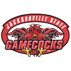
A red and black fighting rooster in a red with black trim oval and encircled wordmark “JACKSONVILLE STATE” in white and “GAMECOCKS” in red with white highlights on a black formed background.

Jacksonville State Gamecocks
2023 - Present
A double-lined wordmark "JAX STATE" in red with white highlights on a black-formed background.
Font: Custom

Jacksonville State Gamecocks
2023 - Present
A wordmark "JAX STATE" in red with white highlights on a black formed background.
Font: Custom

Jacksonville State Gamecocks
2002 - Present
A wordmark "GAMECOCKS" in red with white highlights on a black formed background.
Font: Custom

Jacksonville State Gamecocks
2002 - Present
A double lined wordmark "JACKSONVILLE STATE" in red with white highlights on a black formed background.
Font: Custom

Jacksonville State Gamecocks
2002 - Present
Initials "JSU" in red with white highlights and on a black formed background.
Font: Custom

Jacksonville State Gamecocks
2002 - Present
A wordmark "JACKSONVILLE" in red with white highlights on a black formed background.
Font: Custom
Jacksonville State Gamecocks Logo History
The Jacksonville State Gamecocks Wordmark logo has remained a consistent visual element throughout the Jacksonville State Gamecocks logo history. While typography and spacing have changed, each wordmark supports the school’s athletic identity across uniforms, facilities, and media use. Historical and institutional details can be found on the official Wikipedia page of Jacksonville State Gamecocks.
Over the years, the Jacksonville State Gamecocks Wordmark logo transitioned from simple lettering to cleaner, modern styles. These refinements align with contemporary branding standards while keeping familiarity intact. All versions are preserved here as clear Jacksonville State logo PNG files, allowing fans and designers to track each stage of the Jacksonville State Gamecocks logo history.
Although this page highlights wordmarks, they are closely connected to the team’s main symbol. To view how both elements work together, visit Jacksonville State Gamecocks Primary Logo Page. Combined, the primary mark and Jacksonville State Gamecocks Wordmark logo complete the visual identity documented across the full Jacksonville State Gamecocks logo history.


