George Mason Patriots
A connected green with a gold trim initials “GM” above a black wordmark “GEORGE MASON” above smaller wordmark “ATHLETIC” in green. The “GM” monogram distinguishes the university as the world`s only university to use those initials in its logo.
George Mason Patriots
2024 - Present
Arched double-lined wordmark "GEORGE MASON" in green.
Font: Industry Inc type
https://befonts.com/industry-inc-font-family.html
George Mason Patriots
2024 - Present
An arched wordmark "GEORGE MASON" in green.
Font: Industry Inc type
https://befonts.com/industry-inc-font-family.html
George Mason Patriots
2024 - Present
A wordmark "GEORGE MASON" in green.
Font: Industry Inc type
https://befonts.com/industry-inc-font-family.html
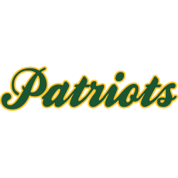
George Mason Patriots
2024 - Present
A scripted wordmark "Patriots" in green with a gold outline.
Font: Unknown
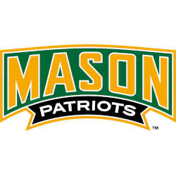
George Mason Patriots
2012 - 2017
A wordmark "MASON" in yellow with white trim on a green background and "PATRIOTS" in white on a black banner.
A new shade of gold.
Font: Custom
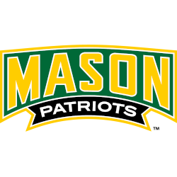
George Mason Patriots
2004 - 2012
Wordmark "MASON" in yellow with white trim on a green background and "PATRIOTS" in white on a black banner.
Font: Custom
George Mason Patriots Logo History
The early George Mason Patriots Wordmark logo designs used simple, traditional lettering that reflected the university’s developing athletic identity. As the program expanded, the typography gained stronger angles and improved spacing, creating a more recognizable look. You can compare these changes with the team’s main icons by visiting the George Mason Patriots primary logo page while browsing the available George Mason University logo PNG files here.
Later redesigns introduced sharper lines, bolder strokes, and a more dynamic layout to match the growing energy of the athletics program. These adjustments added more presence to the Wordmark and helped unify the school’s branding across sports. For additional background, the George Mason University Wikipedia page provides useful context that connects these updates to key moments in team history. Together, these changes form a detailed picture of the George Mason Patriots logo history.
Recent versions of the George Mason Patriots Wordmark logo focus on clean shapes and a modern feel while still keeping the school’s familiar color style. This balance gives the identity its long-lasting appeal. With both historic designs and modern artwork displayed here, along with easy-to-use George Mason University logo PNG resources, fans can follow the complete story of the team’s lettering from its earliest versions to today.
College Sports Fan Products
Auto Amazon Links: No products found.


